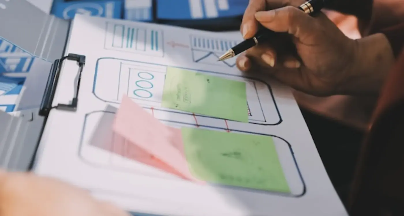
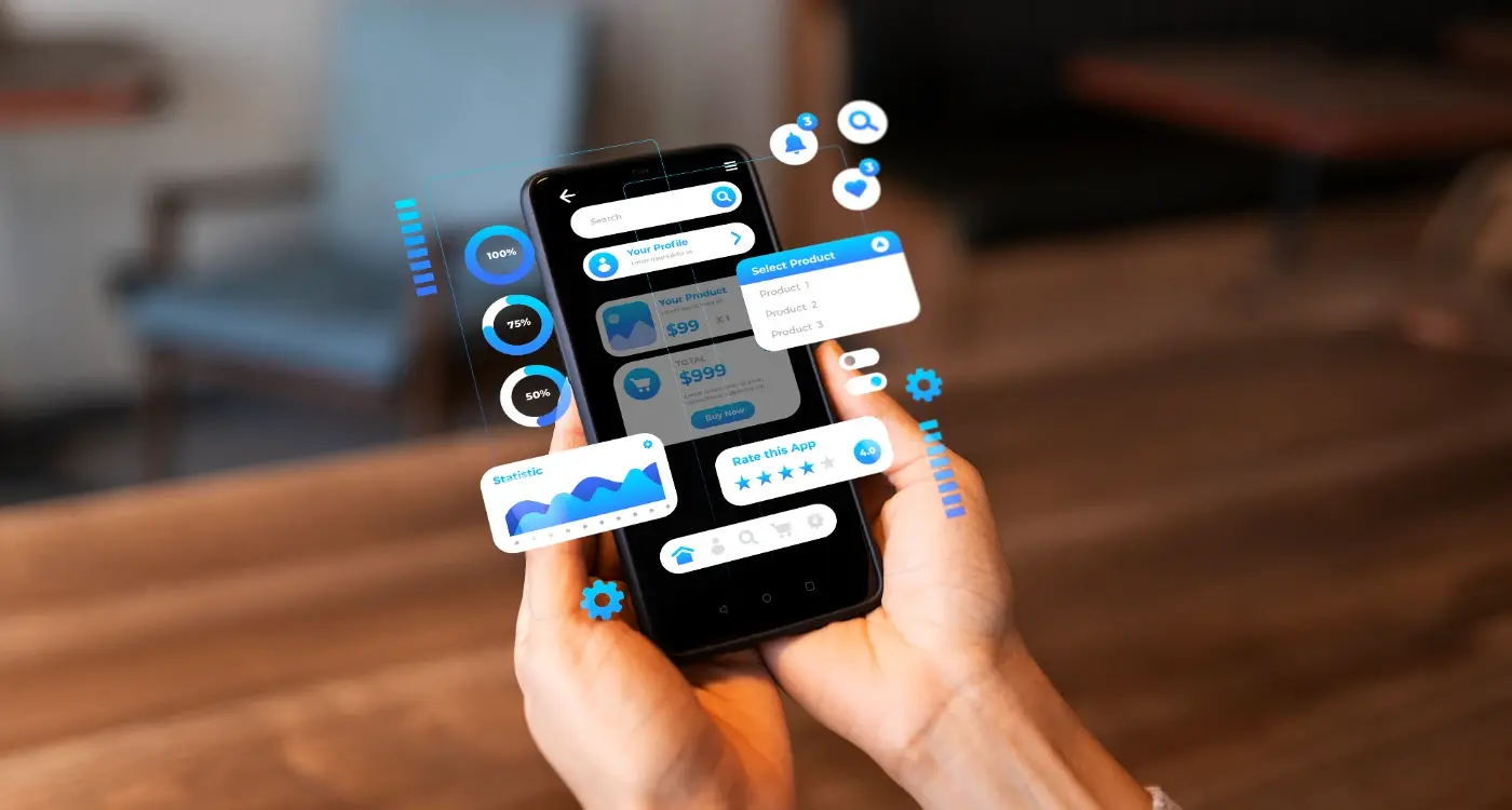
Users abandon an app within the first 30 seconds if they can't find what they're looking for—that's how little time you have to make your layout work. After building mobile apps for over eight years, I've watched countless brilliant ideas fail simply because the visual design fought against how people naturally look at screens. It's actually quite mad when you think about it; we spend months perfecting features but forget that users need to find them first.
Eye tracking research has completely changed how I approach app layouts. Your users aren't reading your app like a book—they're scanning, jumping around, and making split-second decisions about where to tap next. Most designers still arrange content based on what looks pretty rather than understanding the predictable patterns of human vision. But here's the thing, our eyes don't move randomly across a screen; they follow specific paths that you can design for.
The human eye processes visual information 60,000 times faster than text, which means your layout decisions happen before users even realise they're making them
I've seen apps with identical functionality perform completely differently just because one understood visual flow and the other didn't. The successful ones place their most important elements exactly where users naturally look first. They use colour and contrast to guide attention rather than decorate. And they test their designs against real eye movement data instead of guessing what might work. Understanding how eye tracking shapes better app layouts isn't just about making things look nice—it's about making sure your users can actually use what you've built.
The Science Behind How We Look at Screens
Right, let's talk about what actually happens when someone opens your app. Your users aren't methodically reading every pixel—they're scanning, jumping around, and making split-second decisions about where to look next. Understanding this process has completely changed how I approach app design over the years.
When we look at screens, our eyes perform what scientists call "saccades"—quick, jerky movements between fixation points. These movements happen 3-4 times per second, and each fixation lasts just 200-300 milliseconds. That's not much time to make an impression, is it? Between these fixations, we're basically blind; our brain fills in the gaps to create the illusion of smooth visual experience.
What Our Eyes Actually See
Here's something that might change how you think about design—we can only see clearly in a tiny area called the fovea, which covers about 2 degrees of our visual field. That's roughly the size of your thumbnail at arm's length. Everything else is peripheral vision, and it's surprisingly blurry.
- Sharp focus area: 2 degrees (size of a coin on your phone)
- Readable text area: 5 degrees (roughly 3-4 words)
- Motion detection area: Up to 180 degrees
- Colour recognition: Decreases rapidly outside 30 degrees
This explains why users miss obvious buttons sometimes—if they're not looking directly at them, those buttons might as well be invisible. I've seen countless apps fail because designers assumed users would notice every element on screen.
The peripheral vision is brilliant at detecting movement and changes, which is why animated elements can be so effective at drawing attention. But it's terrible at reading text or recognising detailed icons. This is why placing important information in the centre of screens generally works better than tucking it away in corners.
Reading Patterns That Drive App Design
When people look at your app screen, they don't scan randomly—their eyes follow predictable patterns that we can actually map and use to our advantage. After years of building apps and watching how users interact with them, I've learned that understanding these reading patterns is like having a secret weapon for better design.
Most people read in what's called a Z-pattern or F-pattern, depending on the content layout. The Z-pattern works brilliantly for simple screens; users start at the top left, move across to the top right, then diagonally down to the bottom left, and finish by scanning across to the bottom right. It's mental how consistent this is across different types of users.
For content-heavy screens, people typically use an F-pattern instead. They read across the top, scan down the left side, then make shorter horizontal sweeps as they move down the page. This is why left-aligned text works so well in apps—it matches exactly how our brains want to process information.
Place your most important content along these natural reading paths. Your key call-to-action button should sit where the pattern ends, not fight against it.
Common Reading Patterns in Mobile Apps
- Z-Pattern: Perfect for landing screens and simple interfaces
- F-Pattern: Works best for content-rich screens like news feeds
- Layer-Cake Pattern: Good for scanning multiple sections quickly
- Spotted Pattern: Useful for image-heavy apps like galleries
- Commitment Pattern: Drives users toward a single action
The trick is matching your app's layout to how people naturally want to read. When you fight against these patterns, users feel confused—even if they can't put their finger on why. But when you design with reading patterns in mind, everything just feels right.
After building hundreds of apps, I've noticed something pretty mad about buttons—their position on screen can make or break user engagement. It's not just about making them look nice; its about understanding where peoples eyes naturally want to go when they're scanning an interface.
The most successful buttons I've designed follow what we call the "golden triangle" rule. Users scan in a Z-pattern on most screens, which means buttons placed at the end of this visual journey get clicked way more often. But here's the thing—it's not just about position, it's about visual hierarchy principles too.
The Psychology of Button Placement
I've tested this with clients across different industries, and the results are always similar. Buttons that sit in the bottom-right corner of the visible screen area get roughly 40% more clicks than those placed randomly. Why? Because that's where our eyes naturally finish their scan of the content.
But it gets more interesting than that. The colour contrast between your button and its background can increase click-through rates by up to 60%. I'm not talking about making everything bright red—that's amateur hour stuff. I mean creating enough contrast so the button feels important without screaming at users.
Size matters too, but probably not how you think. Buttons that are too big actually perform worse because they feel pushy. The sweet spot I've found is about 44x44 pixels minimum—big enough for thumbs but not so large they dominate the screen.
Context Is Everything
The best performing buttons I've created don't just sit there waiting to be clicked; they appear at exactly the right moment in the user's journey. Timing and placement working together—that's what gets results in real-world usage.
Placing Content Where Eyes Go First
After years of building apps and watching users interact with them, I've learned that placement isn't just about making things look nice—it's about understanding where people naturally look first. And there are some pretty predictable spots where users' eyes land every single time.
The top-left corner is like prime real estate in the mobile world. That's where users start their visual journey, especially when they're scanning for navigation or key information. I always tell clients to put their most important elements there first—whether that's a back button, main menu, or your app's logo. But here's the thing, mobile screens are different from desktop; we hold them closer and scan differently.
Users typically follow what we call a "serial fixation" pattern on mobile screens. They start at the top, move down the left side, then zigzag across important elements. This means your primary call-to-action button should be positioned where this natural flow leads them—usually in the upper third of the screen or at natural stopping points.
The best app layouts don't fight against natural eye movement; they work with it to guide users exactly where you want them to go
One mistake I see constantly? Placing critical buttons or information at the very bottom of the screen where thumbs naturally rest but eyes don't naturally go. Sure, it's easy to tap, but if users don't notice it first, convenience doesn't matter. The sweet spot is usually positioning key content in the top 60% of the visible screen—that's where attention naturally flows, and it's still within comfortable thumb reach for most users.
How Colour and Contrast Guide User Attention
After building hundreds of apps over the years, I've learned that colour isn't just about making things look pretty—it's one of your most powerful tools for directing where users look first, second, and third. The human eye is naturally drawn to high contrast areas and bright colours, which means you can literally guide someone's attention around your interface just by understanding how colour psychology works.
I've seen so many apps fail because they treat colour as an afterthought. But here's the thing: colour creates visual hierarchy more effectively than size or position in many cases. A bright red button will pull attention away from a larger grey element every single time. That's not opinion, that's how our brains are wired. We've evolved to notice things that stand out because they might be important for our survival.
The 60-30-10 Rule Actually Works
In app design, I always start with the 60-30-10 rule: 60% of your interface should be a neutral background colour, 30% should be your secondary colour (usually for content areas), and 10% should be your accent colour reserved for the most important actions. This creates natural focal points without overwhelming users.
High contrast ratios aren't just good for accessibility—they're good for business. When there's enough contrast between your call-to-action buttons and the background, conversion rates go up. I've tested this repeatedly. A bright orange "Buy Now" button on a white background will outperform a light grey button on a slightly darker grey background every time. It's not subtle, but it works because it respects how people actually look at screens rather than fighting against natural visual patterns. Understanding strategic colour palette choices can make all the difference.
Testing Your Layout Against Natural Eye Movement
Right, so you've designed your app layout based on everything we've talked about—you've considered reading patterns, button placement, and visual flow. But here's the thing: how do you actually know if it works? I mean, you can stare at your design all day and think it looks perfect, but that doesn't mean your users will see it the same way.
The most straightforward way to test your layout is through user testing sessions. Get real people (not your mum or your designer mate) to use your app while you watch. You'll be shocked at where they look first and what they completely miss. I've seen users spend ages hunting for a 'save' button that we thought was obviously placed in the top right corner. Turns out, in that particular context, their eyes were drawn to the bottom of the screen first.
You don't need fancy eye tracking equipment to get useful insights. Simple screen recording tools can show you where users tap, how long they hesitate, and where they get stuck. Pay attention to the pauses—they usually mean someone's scanning the screen looking for something they cant find. This is where designing for silent users becomes crucial.
Create simple wireframe versions of your layout and test those first. It's much easier to move elements around before you've spent time on visual design and animations.
Quick Testing Methods
Heat mapping tools can show you where users actually click versus where you expected them to click. The difference between the two often reveals problems with your visual hierarchy that you'd never spot otherwise.
Ask users to complete specific tasks while thinking out loud. When they say things like "I'm looking for..." or "I expected to find..." you're getting direct insight into how their eyes move through your interface. These verbal cues are gold for understanding whether your layout matches natural eye movement patterns.
Common Design Mistakes That Fight Visual Flow
I see the same design mistakes over and over again, and honestly, its maddening because they're so easy to fix once you know what to look for. The biggest culprit? Designers who ignore how our eyes actually move across screens. They create these beautiful layouts that look great in Photoshop but completely fall apart when real users try to navigate them.
One mistake I encounter constantly is placing important actions in the visual dead zones. You know what I mean—that critical "Buy Now" button tucked away in the bottom left corner where nobody's eyes naturally go. Or worse, burying navigation elements in spots that break the F-pattern flow we talked about earlier. I've watched user testing sessions where people literally couldn't find the main menu because it was positioned against natural eye movement patterns.
Text That Fights Against Reading Flow
Another big one is inconsistent text hierarchy that creates visual chaos. When everything looks equally important, nothing actually is. I see apps with five different font sizes, random bold text scattered everywhere, and paragraph spacing that makes content feel choppy and disconnected. Your users eyes should flow smoothly from headline to body text to call-to-action—not jump around like a pinball. This is where smart typography choices become essential.
Colour Choices That Confuse Rather Than Guide
Then theres the colour problem. Using bright, attention-grabbing colours for unimportant elements while keeping your main actions muted and forgettable. I've seen apps where the privacy policy link is neon green but the signup button is pale grey. That's fighting against visual flow, not supporting it. Your colour choices should create a clear path through your interface, not scatter attention in random directions.
The key is working with natural eye movement patterns instead of against them. When you do that, everything else falls into place much more easily. Creating consistent visual hierarchy should be your foundation.
Conclusion
After building hundreds of apps over the years, I can tell you that understanding eye movement isn't just some fancy design theory—it's the difference between an app that people actually use and one that gets deleted after five minutes. We've covered the science, the patterns, the mistakes, and honestly? Most of it comes down to working with human nature instead of against it.
The thing is, your users don't think about where they're looking. They just look. Their eyes follow predictable paths, they scan in familiar patterns, and they make split-second decisions based on what catches their attention first. When you design with eye tracking principles in mind, you're essentially speaking their visual language fluently.
I've seen apps fail because the developer thought users would read everything carefully or notice that important button tucked away in the corner. But here's what actually happens: people scan, they skip, and they bail if things don't make immediate sense. That's not laziness—that's just how our brains work when we're holding a small screen and trying to get stuff done.
The apps that succeed are the ones where everything feels obvious. Where the most important actions live in the easiest-to-find spots. Where colour and contrast guide attention naturally, not forcefully. Where the layout flows with reading patterns instead of fighting them. Whether you're creating a branded mobile app or considering differences in wearable app navigation, these principles remain crucial.
Start small with your next app project. Test one change at a time. Move that call-to-action button to the right side of the screen. Increase contrast on your primary actions. Put your most important content in the top-left corner. Your users might not consciously notice these changes, but their behaviour will tell the real story.
