Shopping cart abandonment affects every online business, but the difference between mobile apps and desktop websites is quite staggering. While desktop cart abandonment sits around 70%, mobile commerce sees rates climbing towards 85%—and that's a problem worth solving. The shift towards mobile shopping has been massive over the past few years, with more people browsing and buying through their phones than ever before. But here's the thing: just because people are using mobile apps more doesn't mean the experience is better.
Understanding purchase behaviour across different platforms isn't just about numbers on a spreadsheet; it's about real people trying to complete real purchases and getting frustrated along the way. When someone adds items to their cart on a mobile app, they're often dealing with smaller screens, different navigation patterns, and various distractions that desktop users simply don't face. The user experience challenges stack up quickly—from the moment they start browsing to the final checkout step.
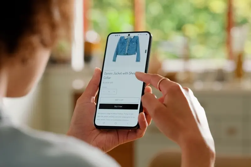
The biggest mistake businesses make is assuming that what works on desktop will automatically work on mobile
Cart abandonment on mobile apps versus desktop involves multiple factors that we'll explore throughout this guide. We're talking about everything from screen size limitations and touch navigation quirks to payment complications and trust issues. Each platform presents unique challenges, and understanding these differences is the first step towards creating better mobile commerce experiences that actually convert browsers into buyers.
The Screen Size Dilemma
When you're shopping on your phone, you're working with a screen that's roughly the size of a playing card. Compare that to a desktop monitor—which gives you the equivalent of an entire desk to spread out your shopping experience—and you start to see the problem straight away.
Mobile screens force users to scroll constantly just to see basic product information. What fits comfortably in a single view on desktop gets chopped up into multiple screens on mobile. Product images that look stunning on a large monitor become tiny thumbnails that users have to tap and zoom to examine properly. This creates friction at every step of the shopping process.
The Information Overload Problem
Here's where it gets tricky for app developers: you can't just shrink everything down and expect it to work. Product descriptions that are perfectly readable on desktop become walls of text on mobile. Users lose patience quickly when they have to scroll through paragraphs of information just to find the price or shipping details.
Many apps try to solve this by hiding information behind additional taps—but this creates its own problems. Users don't want to work hard to find basic details about what they're buying.
The Cart Review Challenge
The most critical point where screen size matters is during cart review. On desktop, users can see their entire order, modify quantities, remove items, and proceed to checkout all in one view. On mobile, this same information gets split across multiple screens or requires endless scrolling.
- Product images become too small to confirm the right item
- Order totals get pushed below the fold
- Editing options require additional navigation
- Shipping and tax information gets buried
When users can't easily review their complete order before purchasing, doubt creeps in. That doubt leads to abandoned carts as users decide to "think about it" or switch to desktop to complete their purchase.
Touch vs Click Navigation
The way people interact with mobile apps versus desktop websites creates a massive difference in cart abandonment rates. When you're using a desktop computer, you've got a mouse cursor that gives you pixel-perfect accuracy—clicking exactly where you want to go is second nature. But mobile devices? That's a completely different story.
Your finger is roughly 44 pixels wide at minimum, which means mobile buttons and links need to be much larger than their desktop counterparts. When e-commerce apps don't account for this, users end up tapping the wrong elements by mistake. Nothing kills the buying mood quite like accidentally hitting the back button when you meant to add something to your cart.
The Fat Finger Problem
Mobile commerce suffers from what we call "fat finger syndrome"—users constantly mis-tap because interface elements are too small or too close together. This becomes particularly problematic during checkout when people are entering payment details or trying to select shipping options. One wrong tap can send them back to the beginning of the purchase flow, and many won't bother starting over.
Make all interactive elements at least 44x44 pixels and ensure there's adequate spacing between buttons—especially during the checkout process.
Touch Feedback Issues
Desktop users get immediate visual feedback when they hover over clickable elements. Mobile users don't have this luxury; they only know if something worked after they've tapped it. Poor touch feedback—or worse, delayed responses—creates uncertainty about whether their action registered, leading to confusion and purchase behaviour that trends towards abandonment rather than completion.
| Navigation Type |
Accuracy |
Feedback |
User Experience Impact |
| Desktop Click |
Pixel-perfect |
Hover states |
Confident navigation |
| Mobile Touch |
Finger-sized |
Post-tap only |
Uncertain interactions |
Speed and Loading Differences
After years of working on mobile apps, I can tell you that speed makes or breaks the shopping experience. When someone's browsing on their phone and your app takes more than three seconds to load, they're gone. Desktop users are a bit more patient—they'll wait maybe five or six seconds—but mobile users? They expect everything instantly.
The truth is, mobile networks are unpredictable. One minute you're on fast WiFi, the next you're on patchy 4G whilst walking down the street. Your app needs to handle these changes gracefully, but many don't. When a user adds items to their cart and the app stutters or freezes during checkout, that's when abandonment happens.
Why Mobile Loading Feels Slower
Mobile processors work differently than desktop computers. They're designed to save battery, which means they don't always run at full speed. Add network variability into the mix, and you've got a recipe for frustration. Desktop connections are typically more stable—people sit at their desk with reliable broadband whilst mobile users are constantly moving between different connection types.
Common Speed Bottlenecks
From my experience building apps, these are the main culprits that slow things down on mobile:
- Large images that aren't optimised for smaller screens
- Too many external payment gateway redirects
- Apps trying to load everything at once instead of prioritising content
- Poor caching strategies that make users re-download the same data
- Overly complex animations during the checkout process
The difference between a smooth mobile checkout and a clunky one often comes down to these technical details. Users don't care about the technical reasons—they just know your app feels slow, and that's enough to make them switch to a competitor or abandon their purchase altogether.
Payment Process Complications
I've watched countless users reach the payment stage of mobile apps only to abandon their carts at the final hurdle. It's frustrating—both for them and for businesses losing sales. The payment process on mobile devices presents unique challenges that simply don't exist on desktop computers.
The most obvious problem is form filling. Typing credit card numbers, addresses, and personal details on a small keyboard is tedious. People make mistakes more easily, autocorrect interferes with numbers, and switching between different input types (numbers, letters, symbols) slows everything down. On desktop, you can fly through payment forms; on mobile, it feels like wading through treacle.
Multiple Payment Steps Create Friction
Mobile apps often split payment information across multiple screens to avoid cramming too much onto one page. This creates more opportunities for users to drop off. Each new screen is another chance for someone to change their mind or get distracted.
The more steps between desire and purchase, the more opportunities for cart abandonment
Guest checkout options help, but many apps still force account creation during purchase. This adds extra fields to complete and passwords to remember—exactly what mobile users want to avoid. Payment methods like Apple Pay and Google Pay have helped reduce friction, but not all apps integrate them properly. Some businesses worry about losing customer data if they make checkout too simple, but the trade-off is often losing the sale entirely. The key is finding the right balance between collecting information and keeping the payment process smooth enough that users actually complete their purchase.
Trust and Security Concerns
When people shop on their phones, something interesting happens—they become much more worried about security than when they're sitting at their desktop computer. It's not that mobile apps are actually less secure; it's just that people feel more vulnerable when they're out and about with their phone.
Think about where you use your phone for shopping. Maybe you're on the train, in a café, or walking down the street. All these places feel less private than your home office or living room. This makes people naturally more cautious about entering their card details or personal information.
The Small Screen Trust Problem
On a small phone screen, it's much harder to spot the security signs that people look for when shopping online. Those little padlock icons, security badges, and trust seals that are obvious on desktop screens become tiny and easy to miss on mobile. People can't easily check the web address or see if the site looks legitimate—everything is compressed into that small space.
Mobile users also worry more about making mistakes when typing their payment details on those small keyboards. One wrong digit in a card number or postcode can be frustrating to fix, and people often abandon their cart rather than struggle through the correction process.
Public Wi-Fi Fears
Many mobile users are connected to public Wi-Fi networks when they're shopping, which makes them nervous about entering sensitive information. Even though most apps use proper encryption, people still feel uneasy about completing purchases when they're not on their secure home network. This fear—whether justified or not—leads to many abandoned mobile carts that would have been completed on desktop.
Notification and Distraction Issues
Mobile phones are interruption machines—there's no getting around it. When someone's browsing your app and adding items to their cart, they're constantly battling against incoming calls, text messages, social media alerts, and push notifications from other apps. This creates a completely different shopping environment compared to desktop, where users typically have more control over their focus.
The mobile experience means your customers are shopping whilst walking down the street, sitting on the bus, or waiting in a queue. They're not settled at a desk with dedicated time to complete a purchase. One notification can pull them away from your checkout process, and by the time they return—if they return—they've often forgotten what they were doing or lost motivation to complete the purchase.
The Multitasking Challenge
Mobile users switch between apps constantly. They might start shopping in your app, receive a WhatsApp message, reply to it, check Instagram, and then struggle to remember where they left off. This behaviour pattern is much less common on desktop where people tend to stay focused on one browser window at a time.
Turn off non-critical push notifications during checkout. The last thing you want is your own app interrupting the purchase process with a promotional message.
Common Mobile Distractions
- Phone calls and text messages
- Social media notifications
- Other app alerts and reminders
- Low battery warnings
- Network connectivity issues
- Physical interruptions from the outside world
Smart app developers account for these distractions by saving cart contents automatically and sending gentle reminder notifications when appropriate. The key is understanding that mobile commerce happens in a fragmented, distracted environment—and designing your user experience accordingly.
Conclusion
After years of working with clients on mobile commerce projects, I've seen the same patterns emerge time and time again. Users abandon their carts on mobile apps for completely different reasons than they do on desktop—and understanding these differences can make or break your conversion rates.
The physical constraints of mobile devices create unique challenges that desktop simply doesn't face. Small screens make product details harder to see; touch navigation can feel clunky compared to precise mouse clicks; slower mobile networks test users' patience. These aren't just minor inconveniences—they're genuine barriers that push users away from completing purchases.
Payment processes that work perfectly on desktop often become frustrating obstacles on mobile. Typing card details on a small keyboard, dealing with poorly designed form fields, or struggling with payment apps that don't integrate smoothly can turn a quick purchase into a tedious task. Users won't persevere through these issues when they can easily complete the same purchase on their laptop later.
Trust issues play a bigger role on mobile too. Users worry more about security when entering sensitive information on their phones, especially on unfamiliar apps or when using public wifi. The smaller interface makes it harder to spot security indicators that might be obvious on desktop.
Mobile users also face constant distractions—notifications, calls, messages, or simply switching between apps can interrupt the purchase journey. Desktop users typically have more focused browsing sessions.
The key takeaway? Mobile cart abandonment isn't just a scaled-down version of the desktop problem. It requires its own solutions, designed specifically for how people actually use their phones. Fix these mobile-specific issues, and you'll see your conversion rates improve dramatically.
