How Do Developers Turn Sketches Into Working Apps?
Have you ever wondered how a simple drawing on paper becomes an app you can actually touch and use on your phone? I get asked this question a lot, and honestly, its one of my favourite parts of what I do. The jump from design to development isn't magic—though it can feel like it sometimes—but there's definitely a method to how we turn those pretty pictures into working code. After years of building apps for everyone from healthcare startups to major retailers, I've seen this process from every angle, and I'll be straight with you; the way most people think it works is quite different from reality.
The thing is, a lot of clients come to us thinking the design is just a blueprint that developers follow exactly, line by line. But here's what actually happens—developers need to interpret those designs, make decisions about how things will behave, and solve problems that didn't exist on the static mockup. When someone taps a button, what happens? How fast should that animation be? What if the user's internet connection drops halfway through? These are questions that only get answered during development, not during design.
The space between a design file and a working app is where the real problem-solving happens, and its filled with hundreds of small decisions that shape the final user experience.
I've worked on projects where we had pixel-perfect designs from top agencies, but the development phase still required constant communication between designers and developers. Why? Because mobile devices are unpredictable—different screen sizes, varying performance capabilities, users with accessibility needs. The design-to-development workflow isn't a straight line; its more of a conversation between what looks good and what actually works in the real world.
Understanding the Design Handoff Process
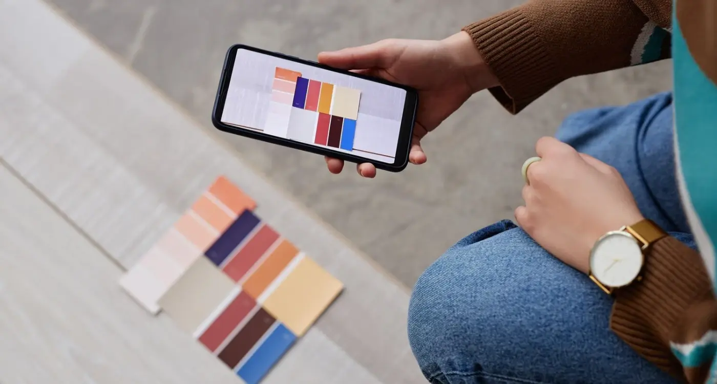
The design handoff is where things get real—this is the moment when those beautiful mockups need to become actual, working code. I've sat through hundreds of these handoffs and honestly, the difference between a smooth one and a nightmare usually comes down to how well the designer and developer communicate before any code gets written. When I'm working with a design team (or receiving designs from a client's designer) the first thing I look for is consistency in the design system; are buttons the same size throughout, are spacing values repeated, do colours follow a clear pattern? This matters because it affects how efficiently we can build the app and how maintainable the code will be six months down the line.
Most design tools these days—Figma, Sketch, Adobe XD—have built-in features for developers to inspect designs and extract values like hex codes, font sizes, and spacing measurements. But here's what they don't tell you: those measurements don't always translate directly to code. A designer might specify 23px padding, but in development we're working with density-independent pixels on Android or points on iOS, and we need to think about how that spacing scales across different screen sizes. I usually have a conversation with the design team about rounding these values to more systematic numbers (like multiples of 4 or 8) which makes the codebase cleaner and actually makes the design more consistent than the original specs.
The other thing that catches people out? Designers often create static screens, but apps are dynamic—they need to handle loading states, error messages, empty states, and edge cases the designer might not have considered. I always ask: what happens when there's no internet connection, what does this screen look like with just one item versus twenty, what if the user's name is really long? Getting answers to these questions during handoff saves massive amounts of time later.
Breaking Down Designs Into Code Components
When a design file lands on my desk—usually a Figma or Sketch file these days—the first thing I do is look for patterns. Not the pretty visual patterns that make designers happy, but the repeating structural patterns that'll save us time and money during development. I'm talking about buttons that appear across multiple screens, card layouts that show up in lists, navigation elements that repeat everywhere. These become what we call reusable components, and they're absolutely critical to keeping development costs down and making future updates manageable.
The way this actually works is pretty straightforward, but it takes practice to get right. I'll open up the design and start grouping elements mentally into three categories: atomic components (things like buttons, input fields, icons), composite components (things like form groups, list items, cards), and full screen layouts. A healthcare app I built had about 40 screens, but when I broke it down properly, it only needed 12 unique atomic components and 8 composite ones. The rest was just different combinations and configurations of those same pieces.
Component Hierarchy
Here's how I typically structure the component breakdown:
- Atoms: buttons, text inputs, icons, labels, switches
- Molecules: search bars, form fields with labels, navigation items
- Organisms: headers, footers, product cards, user profile sections
- Templates: full page layouts that combine organisms
The trick is understanding what needs to be flexible. A button component might need to handle five different states—default, pressed, disabled, loading, and error. If you don't plan for this upfront, you end up creating five separate buttons in code, which is a maintenance nightmare. I learned this the hard way on an e-commerce project where we had 18 different button variations because we hadn't thought through the component structure properly. Fixing that mess took three days.
Design Tokens and Consistency
Something that's become non-negotiable in my workflow is extracting design tokens before writing any interface code. These are your colours, font sizes, spacing values, border radii—basically all the visual properties that need to stay consistent throughout the app. When I'm reviewing a design, I'll create a spreadsheet listing every unique colour value (usually there's way more than designers think), every font size, every spacing increment. Then I'll turn these into variables or constants in the codebase.
For a fintech app we built, the design had what looked like a consistent colour scheme, but when I actually measured it, there were 12 different shades of blue being used when there should have been 3. Having that conversation early—"do we really need blue-primary, blue-primary-darker, blue-primary-slightly-darker, and blue-primary-just-a-bit-darker?"—saves enormous amounts of time later. Its much easier to define these values once than to hardcode them hundreds of times throughout your app. When working with typography, getting font sizing right upfront prevents countless headaches with readability and consistency later.
Create a component inventory spreadsheet before writing code; list every unique button, input, card, and layout type with notes about variations and states—this becomes your development roadmap and helps identify which components can be reused versus which need custom builds.
Choosing the Right Development Tools and Frameworks
The tool question comes up on every single project I take on, and honestly, there's no perfect answer that works for everyone. When a client approaches us, one of the first technical decisions we need to make is whether we're building native apps for iOS and Android separately, or using a cross-platform framework. I know that sounds like developer jargon but its actually quite straightforward—native means writing separate code for each platform, whilst cross-platform means writing one codebase that works on both.
For most projects these days, I lean towards React Native or Flutter. React Native uses JavaScript, which means if you've got web developers on your team they can jump in pretty quickly. Flutter uses Dart, which is less common but honestly? The performance is bloody good. We built a fintech app for a client who needed really smooth animations for their transaction screens, and Flutter handled it beautifully. But here's where experience matters—cross-platform tools come with trade-offs. When you need deep integration with phone features like the camera, biometrics, or health data, native development (Swift for iOS, Kotlin for Android) gives you more control and fewer headaches down the line.
What We Consider Before Choosing
Budget plays a huge role here, obviously. Native development means building everything twice, which can double your costs and timeline. But if you're creating something like a healthcare app where performance and security are non-negotiable, that investment often pays off. We worked on a patient monitoring app where native was the only sensible choice because we needed tight integration with medical devices via Bluetooth. Understanding which features increase development costs early on helps make these technology choices with a realistic budget in mind.
The team you have available matters too. If you've got experienced native developers, use them. If not, cross-platform frameworks let you move faster with a smaller team. I've seen startups waste months trying to hire rare native talent when they could've shipped their MVP already using React Native.
Tools We Actually Use Daily
Beyond the framework itself, we rely on specific tools to turn those designs into working apps:
- Xcode and Android Studio for building and testing (you can't avoid these even with cross-platform tools)
- Figma plugins that export design tokens—colours, spacing, fonts—directly into code format
- Firebase for backend services when clients need something up quickly without building custom servers
- Version control through Git, because nothing worse than losing work or breaking something without being able to roll back
- Device testing labs like BrowserStack so we can check how the app looks on dozens of different phones without buying them all
The reality is that no framework is perfect. React Native sometimes struggles with complex animations. Flutter apps can be larger in file size. Native development costs more. What matters is matching the tool to your specific needs, timeline, and budget—not chasing whatever framework is trendy at the moment. I've rescued projects where teams picked tools based on hype rather than requirements, and it always ends up costing more to fix than if they'd made the right choice upfront.
Building the User Interface
This is where the designs actually become something people can tap and swipe. I usually start with the layouts first—getting the positioning and spacing right before worrying about colours or animations. Its like building the skeleton before adding the skin. Most developers I know work component by component, starting with the simpler screens (like settings or about pages) to get comfortable with the design system before tackling the complex stuff like dashboards or checkout flows.
One project that taught me loads was an e-commerce app where the designer had created these beautiful product cards with parallax scrolling and animated transitions. Looked gorgeous in Figma. But here's the thing—when we built it exactly as designed, the performance tanked on older Android devices; the animations were dropping frames and the whole experience felt janky. We had to strip back some of the fancy effects and find a balance between visual appeal and actual usability. That's the trade-off nobody talks about in design handoffs.
The best interfaces are the ones users dont notice because everything just works the way they expect it to
I typically build the UI layer separately from the business logic at first. This means creating all the screens with placeholder data so you can see how everything flows together. You know what? This approach lets designers review progress early and spot issues before we've wired up all the backend functionality. I've caught countless layout problems this way—things like text overflowing containers when content is longer than expected, or buttons getting pushed off screen on smaller devices. Testing with real content lengths (not just "Lorem ipsum") saves so much rework later. The key is building flexible layouts that adapt to different content and screen sizes rather than fixed designs that break easily. Getting app layouts that feel natural requires this kind of real-world testing with variable content.
Adding Functionality and Logic
Right, so you've got your user interface looking pretty—now comes the bit where we actually make it do something useful. This is where a lot of people think we just "plug in" the features like connecting LEGO blocks, but honestly its more like writing a conversation between different parts of your app. Each button tap, swipe, or form submission needs to trigger specific actions, and those actions need to talk to each other in ways that make sense.
I always start with what I call the "critical path"—the absolute core functionality that makes your app worth having. If you're building a fitness tracker, that means getting step counting working before you worry about social sharing features. If its an e-commerce app, you need product browsing and checkout sorted before adding wishlists. I learned this the hard way years ago when I spent three weeks building a beautiful recommendation engine for a shopping app, only to realise the basic search function was still broken. Users couldn't find products to buy in the first place; the fancy recommendations were completely pointless.
Connecting to Backend Services
Most apps these days need to talk to a server—whether thats fetching user data, processing payments, or storing content. This is where things get proper technical because you're dealing with APIs (basically the language your app uses to request information from servers), authentication systems, and error handling. When I built a healthcare app that needed to pull patient records, we had to implement multiple layers of security checks, handle scenarios where the internet connection drops mid-request, and make sure sensitive data never got cached on the device. Its not just about making the request work; you need to think about what happens when it doesn't work.
State Management and Data Flow
Here's something that separates good apps from buggy messes—how you manage state. State is basically what your app "knows" at any given moment: is the user logged in? What screen are they on? What data have they entered? I've seen apps fall apart because developers didn't properly track state, so users would tap "submit" twice and create duplicate orders, or navigate back and lose all their form data. We use state management libraries that keep everything synchronised, but the real skill is designing the logic so state changes flow predictably through your app.
The trickiest part? Handling edge cases. Sure, your login works perfectly when someone enters correct credentials—but what about when the keyboard covers the login button on smaller screens? Or when someone's email address has special characters? Or when they tap login repeatedly because your loading spinner isn't showing? I keep a running list of these scenarios from every project I work on; its saved me countless hours of bug fixing later. Understanding what makes apps feel difficult to use helps you identify and prevent these frustrating edge cases during development.
- Build core functionality before adding "nice to have" features
- Implement proper error handling for all server requests and user inputs
- Test state changes across different user flows and screen transitions
- Handle offline scenarios gracefully with appropriate user feedback
- Write validation logic that accounts for unexpected user behaviour
- Use debugging tools to track data flow through your application
Testing Throughout Development
Testing isn't something you do at the end when everything's built—that's probably one of the biggest mistakes I see teams make when they're moving from design to development. I mean, if you wait until launch week to start proper testing, you're basically guaranteeing yourself some sleepless nights and a lot of expensive fixes. We learned this the hard way on a healthcare app project where the client wanted to test "when it was ready" and we ended up finding critical issues with medication reminder notifications just days before the App Store submission. Never again.
The way we handle testing now is to build it into every single day of development work. When a developer finishes coding a new screen or feature, they test it themselves first—this catches the obvious stuff like buttons that don't work or text that overlaps weirdly on smaller devices. Then it goes to another developer for a quick review, because fresh eyes always spot things you've been staring at too long to notice. After that, our QA process kicks in properly with both automated tests (for things like login flows and data validation) and manual testing where someone actually uses the app like a real person would.
Types of Testing We Run During Development
There's quite a few different testing approaches we use depending on what part of the app we're working on. Unit tests check that individual pieces of code work correctly—like making sure a function that calculates delivery costs returns the right number. Integration tests verify that different parts of the app work together properly, so your payment system can actually talk to your order confirmation screen. Then there's UI testing where we check that everything looks right and behaves correctly across different devices and screen sizes... because what looks perfect on an iPhone 14 might be completely broken on an older Android device with a smaller screen.
- Unit testing for individual functions and code logic
- Integration testing to verify components work together
- UI testing across different devices and screen sizes
- Performance testing to check loading times and responsiveness
- Accessibility testing for users with disabilities
- User acceptance testing with real people from your target audience
One thing that's changed in recent years is how much we focus on automated testing tools. They're not perfect and they cant catch everything, but they save so much time on repetitive checks. For a fintech app we built, we set up automated tests that run every time code gets updated—checking that login works, transactions process correctly, and account balances display properly. This means we catch bugs within minutes of them being introduced rather than weeks later when they're much harder to trace back to their source.
Test on real devices, not just simulators. We keep a drawer full of older phones specifically for testing because simulators dont show you the real performance issues that users will actually experience—especially on devices that are a few years old with less memory and slower processors.
When Users Should Test Your App
Getting actual users involved in testing is something I wish more clients understood the value of. You can have the most thorough QA team in the world, but they're never going to use your app the same way a confused first-time user will at 11pm on their commute home. We usually run user testing sessions midway through development—not at the end—because that's when you can still make meaningful changes without rebuilding everything. For an e-commerce app, we discovered during testing that users were completely missing the search filters because they expected them to be in a different location based on other shopping apps they used regularly. That was a quick fix during development but would have been a nightmare to change after launch when we'd already built our entire navigation system around the original design. Running effective testing sessions requires avoiding common user research mistakes that can invalidate your results.
Preparing for Launch
Right, so you've built your app and its working beautifully in testing—but launching is where I've seen even experienced teams mess things up. The difference between a smooth launch and a disaster often comes down to how well you prepare in those final weeks, and trust me, there's more to it than just pressing the submit button on the app stores.
First thing is sorting your app store presence properly. I always tell clients that your app store listing is basically your shop window; if it looks rubbish, people won't download no matter how good the app actually is. You need compelling screenshots (I usually recommend 4-6 that show your apps core features), a clear description that explains what problem you solve, and honestly? A decent app preview video makes a massive difference to conversion rates. One fintech client of mine saw their downloads jump by 40% just from adding a 30-second preview video that showed the app in action. Getting your market positioning right is crucial here—I've seen positioning mistakes kill promising apps before they even get a chance to find their audience.
Then there's the technical prep that people forget about. You need to set up your crash reporting and analytics before launch, not after—I've made that mistake before and it's bloody frustrating trying to debug issues when you cant see whats happening. Tools like Firebase Crashlytics or Sentry should be integrated and tested. Also, make sure your backend can handle the load; I worked on an e-commerce app once where we had to delay launch by two weeks because the API kept falling over under stress testing. Better to find that out before thousands of users are trying to check out, yeah?
And here's something people often overlook: you need a proper rollout strategy. I rarely recommend launching to everyone at once anymore. Instead, do a soft launch in a smaller market first, watch the data, fix any issues, then expand. Its way less stressful and you avoid those nightmare scenarios where a critical bug reaches millions of users on day one. For e-commerce apps especially, making sure you've got the purchase flow optimised before launch can make the difference between success and failure in those crucial first weeks.
Conclusion
The journey from design to development isn't as mysterious as it seems once you've done it a few times. I mean, sure, there are technical challenges and bits that go wrong (they always do), but the fundamental process stays pretty consistent whether you're building a simple e-commerce app or a complex healthcare platform with FHIR integration.
What I've learned over the years is that the best development workflows are the ones that stay flexible. You can have all the planning documents and design specs in the world, but something always changes once you start building—maybe a third-party API doesn't work quite how you expected, or user testing reveals that what looked great in Figma feels clunky on an actual device. The teams that succeed are the ones who can adapt without losing sight of the core user experience they're trying to create.
The thing about turning sketches into working apps is that its both more straightforward and more complex than people think. The technical steps? Those are fairly standardised now. You break designs into components, choose your tools, write your code, test relentlessly, and ship. But the real skill comes in making hundreds of small decisions along the way—when to compromise on a design detail for performance reasons, which features to build first, how to handle edge cases that nobody thought about during the design phase. That's where experience really matters, and honestly, its something you only learn by building lots of apps and making lots of mistakes. The good news? Each project teaches you something new about the design to development process, and that knowledge compounds over time. You get faster, your code gets cleaner, and you develop an intuition for what will work before you even start building.
Frequently Asked Questions
Based on my experience, most apps take 3-6 months from design handoff to launch, depending on complexity. A simple e-commerce app might be ready in 12-16 weeks, whilst something complex like a healthcare app with integrations can easily take 6-9 months including proper testing phases.
The biggest mistake I see is waiting until the end to do proper testing—I've rescued projects where critical bugs were discovered days before App Store submission. Testing should happen throughout development, not just at the end, because fixing issues early costs a fraction of what it does later.
For most projects, I lean towards cross-platform tools like React Native or Flutter because they're cost-effective and faster to market. However, if you need deep device integration (like complex camera features or health data) or maximum performance, native development is worth the extra investment.
This happens more often than people think—I've had beautiful designs that performed terribly on older Android devices or caused layout issues on smaller screens. The key is maintaining open communication with designers and being willing to adapt designs for real-world constraints whilst preserving the core user experience.
I always ask designers about edge cases the mockups don't show—what happens with long usernames, loading states, error messages, or when there's no internet connection. Getting answers to these scenarios during handoff prevents weeks of back-and-forth later in development.
From my projects, proper testing typically accounts for 20-30% of your total development timeline and budget. Skimping here is false economy—I've seen teams spend more fixing post-launch issues than they would have spent on thorough testing upfront.
I run user testing sessions midway through development, not at the end, because that's when you can still make meaningful changes without rebuilding everything. For one e-commerce project, user testing revealed navigation issues that were a quick fix during development but would have been a nightmare to change after launch.
Beyond the technical prep, your app store presence is crucial—compelling screenshots and a clear description that explains what problem you solve can make or break your downloads. One fintech client saw downloads jump 40% just from adding a 30-second preview video showing the app in action.
Share this
Subscribe To Our Learning Centre
You May Also Like
These Related Guides
How Do I Design for Users with Colour Blindness?

How Do I Design Micro-Interactions That Don't Slow Down My App?