How Do I Make My App Work for People With Motor Disabilities?
Most app developers don't think about motor disabilities until someone points out they've built something that's basically impossible to use for millions of people. I get it—when you're focused on shipping features and hitting deadlines, its easy to miss the fact that those tiny buttons you made look sleek? They're actually excluding a huge chunk of your potential users. People with conditions like cerebral palsy, Parkinsons, arthritis, muscular dystrophy, or even temporary injuries like a broken arm struggle with the standard tap-and-swipe interactions we all take for granted. And here's the thing—making your app work for people with motor impairments isn't just the right thing to do, it actually makes your app better for everyone.
I've worked on apps where clients initially pushed back on accessibility improvements because they thought it would compromise their design vision or add months to the timeline. But the reality? Most motor accessibility fixes are surprisingly straightforward once you understand what you're solving for. We're talking about things like making touch targets bigger, reducing reliance on precise gestures, giving people more time to complete actions, and building in alternative ways to navigate. Nothing thats going to turn your app upside down.
The best apps aren't just functional for some users—they're usable by as many people as possible, regardless of how they physically interact with their device.
This guide walks you through the practical steps you need to take to make your app genuinely accessible for people with motor disabilities. No theory. No fluff. Just the things I've learned from actually building apps that work for real people with real challenges. Whether you're designing a new app from scratch or retrofitting an existing one, you'll find specific techniques you can implement straightaway to make your app more inclusive without sacrificing your design or bloating your development timeline.
Understanding Motor Disabilities and Mobile Use
Right, lets start with the basics—what do we actually mean when we talk about motor disabilities? It's a broad term that covers loads of different conditions, and I mean its really important to understand that not all motor disabilities are the same. Some people might have limited movement in their hands or fingers, others might experience tremors that make precise movements difficult, and some folks might not be able to use their hands at all. The range is massive.
What I've learned over the years is that motor disabilities can be temporary, permanent, or situational. Someone might have arthritis that makes their fingers stiff in the morning. Or they've broken their arm and its in a cast for six weeks. Or—and this is one people forget—they're holding a baby in one arm and trying to use their phone with the other hand. That last one? That's situational disability, and it affects way more people than you'd think.
Here's the thing though—when people with motor disabilities try to use mobile apps, they face challenges that most designers never consider. Small buttons become impossible targets. Precise gestures like pinch-to-zoom can be frustrating or downright unusable. Time-limited actions create stress and often end in failure. And complex multi-touch gestures? Forget about it.
Common Motor Conditions That Affect Mobile Use
- Parkinsons disease and other conditions that cause tremors
- Cerebral palsy which affects muscle control and coordination
- Arthritis that limits finger movement and causes pain
- Muscular dystrophy that weakens muscles over time
- Spinal cord injuries affecting hand and arm function
- Stroke effects that impact one side of the body
- Repetitive strain injuries from overuse
The mobile screen itself creates unique problems too. Unlike a desktop where you might use specialist hardware or software to help with navigation, on a phone you're pretty much stuck with the touchscreen. Sure, there are assistive devices and alternative inputs we can support (more on that later), but the default experience needs to work for everyone. That's where good design comes in, and honestly its not that hard once you know what to look for.
Making Buttons and Touch Targets Work Better
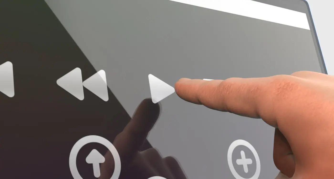
Right, lets talk about buttons and touch targets—because honestly, this is where most apps get it completely wrong. I've reviewed hundreds of apps over the years and you know what? The most common issue I see is touch targets that are way too small. And I mean way too small. We're talking about buttons that are difficult for anyone to tap accurately, let alone someone with motor impairments. When you're building apps for multiple screen sizes, this becomes even more critical as small targets become virtually impossible to hit on smaller devices.
The Apple Human Interface Guidelines recommend a minimum touch target size of 44x44 pixels, whilst Android suggests 48x48 density-independent pixels. But here's the thing—those are minimums, not goals. In my experience building apps for users with motor disabilities, you really want to be aiming for touch targets that are at least 60x60 pixels or larger where possible. Sure, it might mean rethinking your layout a bit, but its worth it. The difference in usability is massive.
Spacing matters just as much as size, actually. If you've got buttons sitting right next to each other with no padding, even large touch targets become problematic because users might accidentally trigger the wrong action. I always recommend at least 8-10 pixels of clear space between interactive elements—more if you can manage it without making the interface look weird.
What Makes a Good Touch Target
There are a few key things that separate good touch targets from bad ones, and they're not all obvious:
- Size matters most—bigger is genuinely better for motor accessibility
- Clear visual boundaries help users know exactly where to tap
- Adequate spacing prevents accidental taps on adjacent elements
- Consistent placement means users don't have to hunt for controls
- Visual feedback on tap confirms the action was registered
One mistake I see constantly is designers making the visual button smaller than the actual touch target. This confuses users because they're not sure where they need to tap. The interactive area should match what you're showing visually—don't make people guess.
Position your most important actions towards the centre or bottom of the screen where they're easier to reach with one hand; avoid putting critical buttons in the top corners where they require more precise motor control to access.
Interactive Elements Need Visual States
Every button and interactive element in your app needs clear visual states—normal, pressed, disabled, and focused. This isn't just about making things look nice, its about giving users confidence that their input has been recognised. When someone with tremors taps a button, they need immediate visual feedback to know the tap registered. A slight colour change or depression effect that happens instantly makes all the difference. I've tested apps where the visual feedback was delayed by even half a second and users would tap multiple times thinking it hadn't worked, which obviously causes problems.
Designing Gestures That Actually Work
Right, so gestures are a tricky thing to get right—even for people without motor disabilities. I mean, some apps expect you to perform these complex swipes and pinches that honestly feel like you're doing finger gymnastics. But here's the thing; for someone with limited hand mobility or tremors, gestures like pinch-to-zoom or precise swipes can be completely impossible to use. And that means they're locked out of your app entirely.
The big mistake I see developers make is assuming everyone can perform the same gestures with the same accuracy. They cant. Some people use their phones with one hand, some use assistive devices, and others might have conditions that affect their fine motor control. So when you're designing gestures, you need to think about alternatives—always. Never rely on a single gesture as the only way to do something important. This is particularly crucial if you're developing specialized apps like wearable applications where the interaction paradigms are even more limited.
Gestures You Should Be Careful With
Here's a list of gestures that often cause problems and what you can do instead:
- Pinch-to-zoom: Add zoom buttons as an alternative, or double-tap options
- Complex swipe patterns: Offer simple tap-based navigation too
- Long press actions: Provide a menu button or icon as a backup
- Multi-finger gestures: These are basically unusable for many people, avoid them if possible
- Drag-and-drop: Include a tap-to-select and tap-to-place option instead
- Shake gestures: Not everyone can shake their device (and it looks a bit mad in public anyway!)
What Actually Works
The best approach? Keep gestures simple and provide alternatives. A single tap should always be an option. If you must use gestures, make them forgiving—accept imprecise movements and dont require pixel-perfect accuracy. Test your gesture tolerance levels; if someone's hand shakes slightly during a swipe, will your app still recognise it? It should. And please, let people turn off gesture controls entirely if they want to—some users genuinely prefer traditional buttons and menus, and thats perfectly fine.
Building Adjustable Time Limits and Auto-Actions
Right, this is one of those areas where so many apps get it wrong and its actually quite easy to fix. Time limits and auto-actions—like sessions that expire, popups that disappear, or screens that automatically advance—can be proper nightmares for people with motor impairments. Someone might need extra time to carefully position their finger, use a stylus, or work through an assistive tool to complete an action. If your app rushes them, you've just locked them out of using it properly.
I've seen apps with 30-second timeout warnings that disappear before users can even reach the "extend session" button. Bloody hell, that's frustrating for everyone, but for someone with limited dexterity its basically unusable. The fix? Make every timed element adjustable or—even better—give users enough time that they dont need to worry about it in the first place. And I mean really enough time, not just what feels generous to you as an able-bodied developer.
Session Timeouts and Warning Messages
Banking apps are notorious for this, but loads of other apps do it too—they boot you out after a few minutes of "inactivity". Sure, security matters, but here's the thing: someone using switch control or voice navigation might appear inactive to your app whilst they're actually working hard to complete a task. Build in warnings that stay visible until the user dismisses them, and give people the option to extend their session before it expires. Twenty seconds isn't enough; try two minutes minimum for that warning period. This is especially important in healthcare app environments where users might be dealing with multiple tasks simultaneously.
Users with motor disabilities often need 3-5 times longer to complete the same touch interactions as users without disabilities
Auto-Advancing Carousels and Popups
Those image carousels that auto-advance every few seconds? They need pause buttons that are easy to hit. Same goes for popups, tooltips, and notification banners that disappear automatically. The user should always be in control of when content disappears, not the other way around. I usually recommend pausing all auto-actions when the user is interacting with any part of the screen—its a simple respect for their pace and it makes your app more usable for literally everyone.
Creating Alternative Input Methods
Here's something most developers don't think about—touch isn't the only way people interact with their phones. I mean, its easy to assume everyone just taps and swipes but some users need completely different ways to control apps. Voice commands, switch controls, head tracking, external keyboards... the list goes on and on.
Voice control has come a long way in recent years and honestly, it should be a priority for any app claiming to be accessible. Both iOS and Android have built-in voice control systems that can navigate your entire interface if you design it properly. The trick is making sure every interactive element has a clear, speakable label. A button that just says "Submit" is fine—a button with no label at all? Useless for voice users. As we move towards passwordless authentication methods, voice commands are becoming an increasingly important part of secure app access too.
Switch Control and External Devices
Switch control lets users navigate apps using external switches (basically simple buttons they can press with whatever part of their body works best for them). The system highlights elements one at a time and the user activates their switch when it lands on what they want. Your app needs to support keyboard navigation for this to work properly; if you've built custom controls that ignore standard input methods you're going to have problems.
Making Everything Keyboard Accessible
External keyboards and assistive devices need proper focus management. Every interactive element should be reachable using tab navigation and the focus order should follow a logical path through your interface. I've seen apps where the focus jumps all over the place—it's confusing for everyone but particularly difficult for users relying on keyboard navigation. Test your app using only a keyboard (no mouse, no touch) and you'll quickly find where the problems are. Actually do this... you'd be surprised what you discover.
Testing Your App With Real Users
Right, so you've built all these features to help people with motor impairments use your app—but here's the thing, you won't actually know if they work until real people try them. I've seen so many apps that looked perfect on paper but completely fell apart when users with motor disabilities tried to navigate them. Its frustrating, honestly, because most of these issues could have been caught early with proper testing. Testing mobile app features can be complex, but accessibility testing requires real-world scenarios that you simply can't simulate in development.
The best approach? Recruit actual users who have motor impairments to test your app. Not just once at the end, but throughout development. I know it sounds like extra work (and it is, to be fair) but the insights you'll get are worth their weight in gold. You'll discover problems you never even considered—like how someone using a head pointer needs different spacing between buttons than someone with tremors, or how voice control users expect certain patterns that your app might be missing.
Finding the Right Testers
You can work with disability advocacy groups, accessibility testing services, or even post in online communities dedicated to assistive technology. Pay your testers properly; they're providing professional feedback that will make your app better. When testing, give people actual tasks to complete rather than just asking them to "look around"—this shows you where the real friction points are in your interface. Consider running soft launch testing specifically focused on accessibility to gather feedback before your main release.
Watch people use your app, dont just read their feedback reports. Seeing someone struggle with a gesture or miss a button completely tells you so much more than a written summary ever could.
What to Look For
Pay attention to completion rates for tasks, how many attempts it takes to hit targets, and where users get stuck or give up entirely. Ask questions about fatigue too—can they use your app comfortably for extended periods? Sometimes an interface works fine for two minutes but becomes exhausting after ten. Test with different assistive technologies like switch controls, voice access, and external pointing devices because your app needs to work with whatever tools people are actually using.
Common Mistakes to Avoid
Right, lets talk about the mistakes I see people make when they're trying to build accessible apps for users with motor disabilities. And honestly—some of these are so common it drives me a bit mad because they're completely avoidable if you just test your app properly.
The biggest mistake? Making touch targets too small. I mean, we covered this earlier but its worth repeating because developers still get this wrong all the time. They'll create these tiny buttons that look great on their design mockups but are impossible to tap accurately. Apple recommends 44×44 points minimum; Android says 48×48 density-independent pixels—but here's the thing, those are minimums not targets. Go bigger where you can. Your users will thank you for it.
Another massive error is forcing gesture-only navigation without alternatives. Swipe-to-delete is fine, but you need a button option too. Pinch-to-zoom looks fancy but some people cant do it. Always provide multiple ways to complete the same action—its not about dumbing down your interface, its about giving people choice in how they interact with your app. This is particularly important when managing different stakeholder expectations during development—accessibility shouldn't be compromised for aesthetics.
Then there's the timing issue. Apps that auto-advance screens or dismiss popups too quickly cause real problems. I've seen apps where error messages disappear after 3 seconds...what if someone needs longer to read that? What if they're using a switch control device that takes time to navigate? Build in adjustable timeouts or better yet, let users dismiss things manually.
And heres one that catches people out—not testing with actual accessibility features turned on. Developers will build an app, test it normally, ship it, then wonder why they get complaints from users with disabilities. Switch Control and Voice Control change how your app behaves; you need to test with these features active to catch issues before launch.
Using iOS and Android Accessibility Features
Right, so here's something that genuinely surprises people—both iOS and Android have built-in accessibility features that are actually quite powerful, but most developers dont use them properly. I mean, these platforms have spent years developing these tools, and yet I still see apps that completely ignore them or implement them halfway. Its a bit frustrating really, because the work is already done for you.
On iOS, you've got things like Switch Control which lets people navigate using hardware switches instead of touching the screen directly. VoiceOver is the screen reader everyone knows about, but AssistiveTouch? That's the one that really helps people with motor impairments because it creates a virtual button overlay that reduces the physical movement needed. And Voice Control lets users navigate entirely through spoken commands—no touching required at all. These features work particularly well when combined with enterprise-ready security frameworks that support multiple authentication methods.
Android's got similar features with TalkBack for screen reading, but also Switch Access which works much like iOS Switch Control. The Accessibility Menu gives users a persistent on-screen menu with quick access to common actions. Sure, these sound technical, but they're not hard to support if you build your app correctly from the start.
The platforms have done the heavy lifting; your job is to make sure your app plays nicely with these existing tools rather than fighting against them
But here's the thing—just because these features exist doesn't mean your app automatically works with them. You need to properly label all your interactive elements, ensure your navigation order makes sense, and test with these features turned on. I always tell clients to actually enable VoiceOver or TalkBack and try using their own app; the experience is eye-opening and you'll quickly find all the places where you've made assumptions about how people interact with your interface. Both platforms provide excellent documentation on supporting these features, so there's really no excuse for not implementing them properly.
Conclusion
Right, so we've covered a lot here—and I mean a lot. But here's what it really comes down to: making your app work for people with motor disabilities isn't some nice-to-have feature you tack on at the end. Its something you need to think about from day one, when you're still sketching out your first designs and planning what your app will actually do.
I've built apps for years now and I can tell you this much; the best accessible features are the ones users don't even notice because they just work. Big touch targets? They help everyone. Clear navigation? Everyone benefits. Alternative input methods? Loads of people use them, not just those with motor disabilities. When you design with accessibility in mind from the start, you end up making a better app for literally everyone who uses it.
And look, I'm not going to pretend this is always easy. Sometimes you'll need to rethink entire interaction patterns or rebuild features you thought were finished. But its worth it—both because it's the right thing to do and because you're opening your app to a massive audience that often gets ignored. That's millions of potential users who'll appreciate that you actually considered their needs.
The testing bit is probably the most important part, honestly. You can follow every guideline and tick every box, but until you watch someone with motor disabilities actually use your app, you won't know if its really working. Those sessions will teach you more than any documentation ever could. Start small if you need to. Make one feature properly accessible, test it, learn from it, then move on to the next one. Progress matters more than perfection.
Frequently Asked Questions
Whilst Apple recommends 44x44 pixels and Android suggests 48x48 density-independent pixels as minimums, you should aim for at least 60x60 pixels or larger where possible. Don't forget to include 8-10 pixels of clear space between interactive elements to prevent accidental taps on adjacent controls.
Pinch-to-zoom, complex swipe patterns, multi-finger gestures, and precise drag-and-drop actions cause the biggest problems. Always provide simple tap-based alternatives for these gestures, such as zoom buttons instead of pinch-to-zoom or menu buttons instead of long-press actions.
Timeout warnings should remain visible for at least two minutes, not the typical 20-30 seconds most apps use. Users with motor impairments often need 3-5 times longer to complete touch interactions, so they need adequate time to respond to warnings and extend their sessions.
Yes, recruiting actual users with motor impairments to test throughout development is essential, not just at the end. You should pay testers properly and give them specific tasks to complete rather than just asking them to browse, as this reveals real friction points in your interface.
Temporary disabilities might include broken arms or injuries lasting weeks, whilst permanent ones include conditions like cerebral palsy or Parkinson's disease. Situational disabilities—like holding a baby whilst using your phone—affect far more people than you'd expect and require the same design considerations.
Test with Switch Control, Voice Control, and AssistiveTouch on iOS, and Switch Access, TalkBack, and the Accessibility Menu on Android. Actually enable these features and try using your own app—you'll quickly discover where you've made incorrect assumptions about user interaction.
Making touch targets too small is the most common error, followed closely by providing gesture-only navigation without alternatives. Many developers create interfaces that look great but are impossible to use accurately, especially for users with tremors or limited dexterity.
Voice control can handle most navigation tasks if your app is properly designed with clear, speakable labels for every interactive element. However, it works best as one option among several—users should always have multiple ways to complete the same actions rather than being forced into a single interaction method.
Share this
Subscribe To Our Learning Centre
You May Also Like
These Related Guides
What Is Accessibility in Mobile App Design and Why Does It Matter?
How Do I Design Buttons That Everyone Can Actually Press?