A major logistics company launched their new event management app for their annual trade conference, expecting thousands of attendees to use it for scheduling, networking, and navigation. Within hours of the event starting, they received complaints from delegates who couldn't read the small text, others who couldn't hear the audio announcements, and some who found the complex navigation impossible to follow. What should have been a showcase of their digital innovation became a barrier that excluded many of their most important clients and partners.
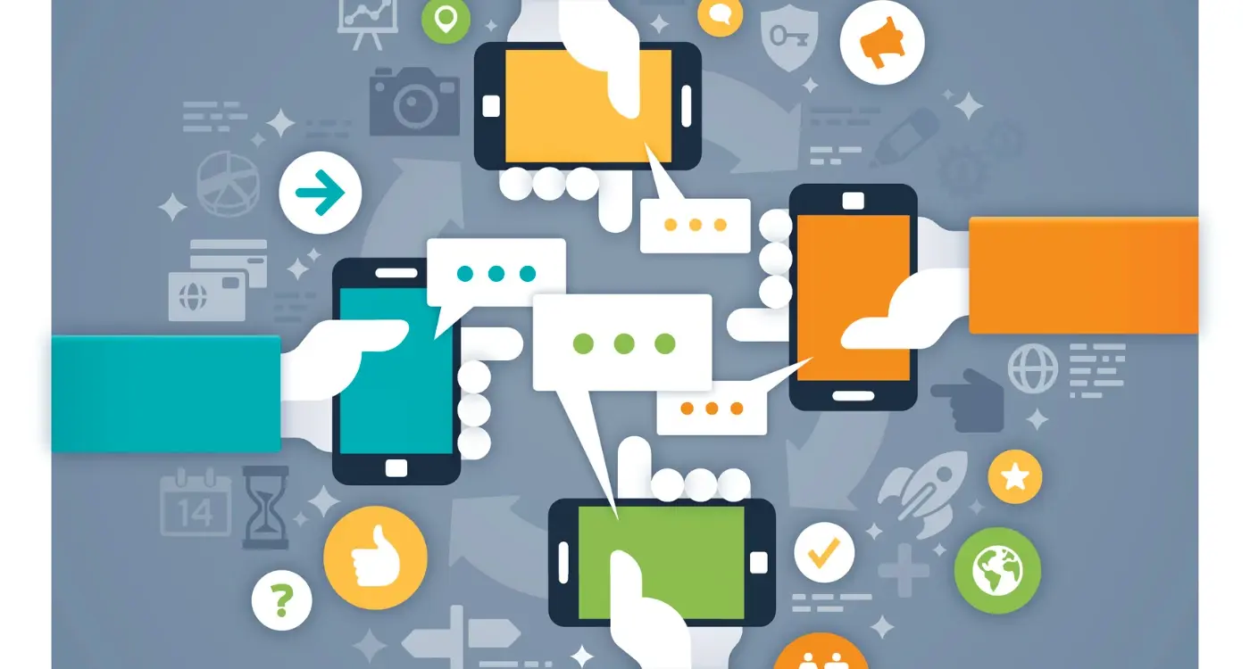
This scenario plays out more often than you might think. When we build event apps, we often focus on the flashy features—the social feeds, the fancy animations, the complex booking systems. But we forget that our users aren't all the same. Some might be visually impaired, others might have hearing difficulties, and many could have motor or cognitive challenges that make using apps differently than we expect.
Making your event app accessible isn't just about doing the right thing—it's about reaching the widest possible audience and creating the best experience for everyone
Accessibility in mobile apps means designing and building your application so that people with disabilities can use it just as effectively as anyone else. This includes visual impairments, hearing difficulties, motor challenges, and cognitive differences. The good news is that inclusive design principles don't just help people with disabilities—they make apps better for everyone. Larger text helps people using phones in bright sunlight, voice controls help when your hands are full, and clear navigation benefits users who are stressed or distracted. Throughout this guide, we'll explore practical steps to make your event app welcoming and usable for all your attendees.
Understanding Web Content Accessibility Guidelines
The Web Content Accessibility Guidelines—or WCAG as most developers call them—are the gold standard for making digital content accessible to everyone. Think of them as the rulebook that helps us build apps that work for people with different abilities and needs. These guidelines aren't just suggestions; they're internationally recognised standards that have been carefully developed by accessibility experts over many years.
WCAG is built around four main principles that are easy to remember: perceivable, operable, understandable, and robust. Your event app needs to be perceivable, which means people must be able to see or hear the content in some way. It needs to be operable—users should be able to navigate and interact with everything. The app must be understandable, so the content and interface make sense to users. Finally, it should be robust enough to work with different assistive technologies like screen readers.
The Three Levels of Compliance
WCAG comes in three levels: A, AA, and AAA. Level A covers the most basic accessibility features—things like providing text alternatives for images. Level AA is where most organisations aim to be; it includes requirements like having good colour contrast and making sure your app works with keyboards. Level AAA is the highest standard but can be quite demanding to achieve across an entire app.
Why This Matters for Event Apps
Event apps present unique challenges because they often need to work quickly and efficiently in busy, noisy environments. Following WCAG helps ensure your app works whether someone is using a screen reader, has limited mobility, or struggles with small text in bright sunlight at an outdoor event.
Designing for Visual Impairments
When I'm working on event apps, visual accessibility is one of those areas where small changes make a massive difference. People with visual impairments—whether they're blind, have low vision, or struggle with colour perception—need to navigate your app just as easily as anyone else. This isn't about ticking boxes; it's about creating genuinely inclusive design that works for everyone.
Screen readers are the backbone of how many visually impaired users interact with apps. These tools read out text and interface elements, but they can only work with what you give them. Every image needs descriptive alt text that explains what's happening—not just "photo" but "conference speaker presenting on stage with graphs showing attendance data." Interactive elements need clear labels that explain their purpose.
Making Text Work for Everyone
Text contrast ratios matter more than most developers realise. Light grey text on white backgrounds might look sleek, but it's impossible to read for users with low vision. The WCAG guidelines recommend a contrast ratio of at least 4.5:1 for normal text and 3:1 for large text. Font sizes should be adjustable too—some users need text much larger than your design mockups suggest.
Test your app's colour scheme by viewing it in greyscale mode. If you can't distinguish between different elements without colour, neither can users with colour vision deficiencies.
Navigation That Makes Sense
Voice-over navigation follows a logical reading order, moving from top to bottom, left to right. Grouping related elements together and using proper heading structures helps screen reader users understand your app's layout without seeing it. When planning your interface design, consider using professional UI design tools that support accessibility features from the start.
- Use high contrast colour combinations throughout your interface
- Provide alternative text for all images and icons
- Support dynamic text sizing across all screens
- Group related interface elements logically
- Test with actual screen reader software regularly
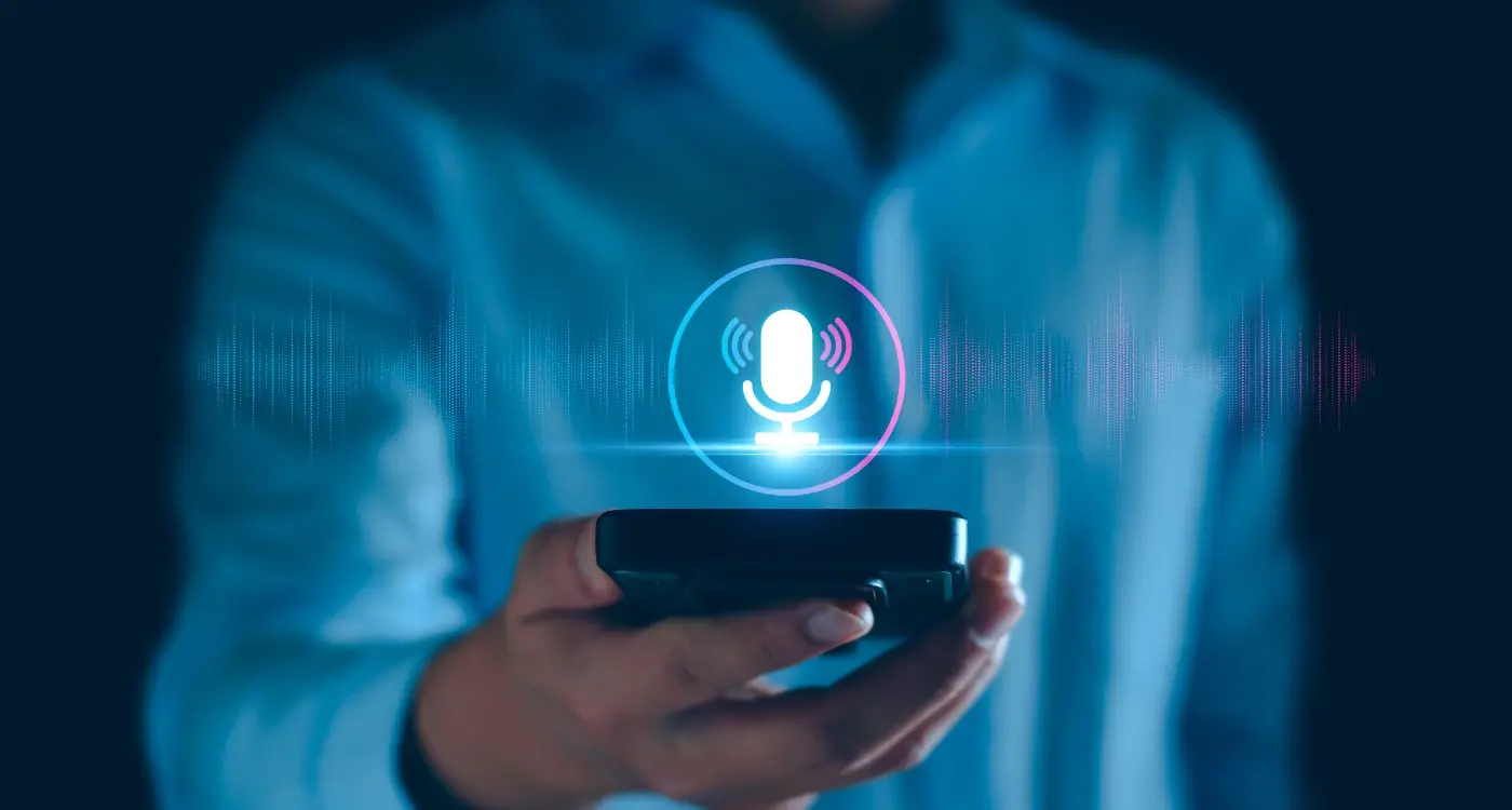
Creating Audio Solutions for Hearing Impairments
When I'm working on event apps, one of the biggest oversights I see is assuming everyone can hear the audio content. That's a mistake that locks out millions of potential users who are deaf or hard of hearing. The good news? Making your event app accessible for people with hearing impairments isn't rocket science—it just needs proper planning.
The most straightforward solution is adding captions to all your video content. But here's what many developers miss: auto-generated captions aren't enough. They're often wrong, especially with technical terms or speaker names that are common at events. You need human-reviewed captions that capture not just words, but context too. This means noting when there's applause, music, or background noise that affects understanding.
Audio Alerts Need Visual Alternatives
Think about all the ways your app uses sound to communicate. Notification beeps, countdown timers, alert chimes—these all need visual counterparts. Flash notifications, vibration patterns, and on-screen alerts work brilliantly here. Some developers worry this will clutter the interface, but good design makes these features feel natural for everyone.
Live Event Considerations
For live events, real-time captioning becomes critical. You'll want to integrate with professional captioning services or provide clear instructions for users to access live transcripts. Don't forget about two-way communication either—if your app has chat features or Q&A sections, these become lifelines for audience participation.
- Provide human-reviewed captions for all video content
- Add visual alerts for all audio notifications
- Include vibration patterns as audio alternatives
- Offer real-time captioning for live content
- Test with actual users who have hearing impairments
The key is remembering that accessibility features often improve the experience for everyone. Captions help in noisy environments, visual alerts work when phones are on silent, and clear text communication benefits all users.
Building Motor-Friendly Navigation
When we talk about motor difficulties, we're covering a wide range of conditions that affect how people move and control their hands, fingers, or other parts of their body. Some people might have tremors, limited fine motor control, or use assistive devices like switches or voice commands to navigate apps. Others might only be able to use one hand or have reduced strength in their grip.
The good news is that making your event app motor-friendly doesn't require a complete redesign—it's about being thoughtful with your interface choices. Touch targets need to be large enough for people to tap accurately; I always recommend a minimum of 44 pixels, but bigger is often better. Spacing between buttons matters too—cramped interfaces cause frustration when someone accidentally taps the wrong thing.
Give People Time and Options
Timing is everything when it comes to motor accessibility. Those countdown timers that automatically log people out? They can be genuinely stressful for someone who needs more time to navigate. Build in generous time limits and always offer the option to extend them. Double-tap gestures might seem convenient, but they're tricky for many users—stick to single taps wherever possible.
The most accessible interface is often the simplest one that still gets the job done effectively
Smart Input Methods
Text input can be particularly challenging, so consider alternatives like voice input, predictive text, or dropdown menus instead of free-form typing fields. When forms are necessary, break them into smaller chunks and save progress automatically. Remember that some users navigate entirely through keyboard commands or switch devices, so every interactive element needs to be reachable without a mouse or direct touch.
Supporting Cognitive and Learning Differences
People with cognitive and learning differences need apps that work with their brains, not against them. This includes people with dyslexia, ADHD, autism, or memory difficulties—and the solutions that help them often make apps better for everyone else too.
The biggest challenge? Information overload. When your event app throws too much information at users all at once, it becomes impossible to process. Breaking content into smaller chunks makes a massive difference; think single concepts per screen rather than cramming everything together.
Clear Language and Simple Navigation
Plain English wins every time. Instead of "leverage synergistic networking opportunities," try "meet other attendees." Your event might sound more corporate with fancy words, but users won't understand what you're asking them to do. Keep sentences short and direct—one idea at a time works best.
Navigation should follow predictable patterns. Put your search function in the same place across all screens; use familiar icons that people already know. When users have to relearn your app's logic on every page, you've lost them.
Memory and Processing Support
Not everyone remembers where they left off or what they were doing five minutes ago. Your app should remember for them. When deciding which features to include in your app MVP, prioritise these memory-supporting functions:
- Save form progress automatically so users don't lose their work
- Show breadcrumbs so people know where they are in the app
- Provide clear confirmation messages when actions are completed
- Allow users to bookmark or save important information for later
- Use consistent visual cues to show what's clickable and what isn't
The key is reducing cognitive load wherever possible. When your app does the thinking work, users can focus on enjoying the event itself.
Testing Your App with Real Users
You can design the most beautiful accessible app in the world, but if you don't test it with real people who have disabilities, you're just guessing. I've learnt this the hard way over the years—what looks perfect on paper doesn't always work in practice.
The best way to test your event app's accessibility is to find people who actually use assistive technology every day. This means reaching out to people who use screen readers, voice control software, or alternative input devices. Local disability groups, universities, and online communities are great places to start your search. If you need professional help with this process, consider hiring developers with accessibility expertise who can guide your testing efforts.
Setting Up User Testing Sessions
When you're running these sessions, give people real tasks to complete. Ask them to register for an event, find session information, or navigate to the feedback form. Watch how they interact with your app—but more importantly, listen to their feedback about what's frustrating them.
Don't just test once and call it done. Accessibility testing should happen throughout your development process, not just at the end. Each time you add new features or make changes, test them with your users again. This approach is particularly important when planning your app budget, as accessibility testing needs to be factored into each development phase.
Pay your testers fairly for their time and expertise. People with disabilities are often asked to provide feedback for free, but their insights are valuable and deserve compensation.
What to Look For
During testing, watch for moments when users hesitate, seem confused, or have to work harder than expected to complete tasks. These moments tell you where your inclusive design needs work. Take notes on everything—even small issues can create big barriers for people with different needs.
Conclusion
Building an accessible event app isn't just about ticking boxes—it's about creating something that genuinely works for everyone who wants to use it. Throughout this guide, we've covered the main areas you need to think about: visual impairments, hearing difficulties, motor challenges, and cognitive differences. Each one requires a different approach, but they all share the same goal of making your app usable by as many people as possible.
The truth is, accessibility often makes apps better for everyone, not just people with specific needs. When you add clear navigation for someone with motor difficulties, you're also helping someone who's trying to use your app whilst walking through a crowded venue. Voice commands designed for blind users become incredibly handy when your hands are full carrying conference materials.
Testing with real users remains the most important step in this whole process. You can follow every guideline perfectly, but if real people can't actually use your app comfortably, you've missed the mark. Don't skip this step—it's where you'll learn the most about what actually works and what doesn't.
Remember, you don't have to implement everything at once. Start with the basics: good colour contrast, clear text, and simple navigation. Build from there as your budget and timeline allow. Even small improvements make a real difference to someone's experience of your event.
Making your event app accessible takes extra effort, but it's effort well spent. You'll end up with an app that works better for everyone and shows that your event truly welcomes all attendees.