How Do I Stop My App Design Looking Outdated?
A music streaming app that dominated the charts five years ago recently lost 40% of its active users—not because their catalogue got worse or their audio quality dropped, but because their interface started feeling clunky compared to newer competitors. The gradient backgrounds that looked fresh back then? Now they scream 2018. The elaborate animations that once wowed users? They just slow people down now. Its a reminder that app design has a shelf life, whether we like it or not.
I've rebuilt interfaces for apps that were only two years old but already looked ancient. The speed at which design trends evolve in mobile is honestly brutal; what feels modern today can look tired remarkably quickly. And here's the thing—users notice. They might not consciously think "this design is outdated" but they feel it through friction, through interfaces that don't match their current expectations, through visual patterns that jar against everything else on their phone.
Your app's design is competing against every other app your users open that day, and if yours looks noticeably different in the wrong ways, you've got a problem.
Over the years I've worked on refreshes for healthcare apps, fintech platforms, e-commerce solutions—apps across every sector really. The challenge is always the same: how do you keep your interface feeling current without chasing every trend that comes along? Because some design updates are about genuine usability improvements, whilst others are just... fashion. Learning to tell the difference between those two things has saved my clients thousands in unnecessary redesigns, and it's saved users from having to relearn interfaces that were working perfectly fine.
This guide will show you how to spot when your design is aging, what actually needs updating versus what can stay, and how to make smart choices that keep your app feeling modern without burning your budget on constant overhauls.
Why App Designs Age Faster Than You Think
Mobile design trends move at a ridiculous pace compared to web design, and there's actually a reason for this that most people don't realise. Every time Apple or Google releases a new operating system—which happens annually—they introduce new design patterns, updated UI components, and fresh interaction models. Users download these updates and immediately start using apps built with the latest patterns. Its like everyone gets retrained on what feels "normal" overnight, and suddenly your app that looked perfectly fine three months ago feels dated.
I've seen this happen with apps I built just two years prior. A healthcare client came back asking why their appointment booking app felt "old" even though it was working perfectly. The issue? They were using iOS 12 style navigation patterns whilst their users were now on iOS 15 with completely different expectations around tab bars, modal presentations, and gesture navigation. The functionality hadn't changed but the visual language had moved on without them.
Screen sizes evolve constantly too—foldable phones, various notches and dynamic islands, different aspect ratios. An app designed for iPhone 8 dimensions looks cramped and poorly spaced on newer devices. Beyond that, user expectations shift based on whatever design patterns the dominant apps are using. When Instagram changes how Stories work or when banking apps start using biometric authentication differently, users expect all apps to follow suit pretty quickly.
The Main Factors That Date Your Design
- Operating system updates introducing new UI components and interaction patterns
- Changes in dominant app behaviours that reset user expectations (think TikTok's influence on video interfaces)
- New device capabilities like improved cameras, better haptics, or different screen technologies
- Evolving accessibility standards that make older designs feel less inclusive
- Performance expectations—users now expect instant loading and smooth 60fps animations as standard
The speed of change is honestly exhausting sometimes, but it's the reality of building for platforms that are updated annually whether we like it or not.
The Tell-Tale Signs Your Design is Showing Its Age
The first thing I look for when someone asks me to review their existing app? The navigation. If I see a hamburger menu as the primary navigation, I know straight away we're looking at something that hasn't been touched since around 2014-2015. It's not that hamburger menus are terrible (they still have their place in specific contexts), but using one as your main navigation pattern now feels a bit like opening a flip phone at a coffee shop—it just screams outdated. Modern apps have moved towards tab bars at the bottom because, well, users kept missing content hidden in those slide-out menus. I've seen conversion rates jump by 20-30% just from making primary actions more visible.
Another dead giveaway is what I call "gradient overload"—those glossy, reflective buttons with heavy drop shadows and multiple gradient layers. If your buttons look like they belong on an iPod Touch from 2010, that's a problem. Same goes for skeuomorphic design elements where everything tries to look like its real-world counterpart; leather textures, stitching, wood grain backgrounds. Users don't need their calculator app to look like an actual calculator anymore—they've moved past that mental model.
Check your app's empty states and error messages. If they're just plain text on a white background with no illustration or helpful guidance, that's a clear sign your design hasn't been updated in years. Modern apps treat these moments as opportunities to maintain brand personality and guide users forward.
Spacing is another telltale sign; older apps tend to cram information together like we're still designing for 3.5-inch screens. If your content feels claustrophobic or elements are touching each other without proper padding, users will subconsciously register it as outdated even if they cant articulate why. Typography matters too—if you're still using system fonts from iOS 6 or Android 4.0, or worse, custom fonts that look like they belong on a 2008 website, people will notice. The spacing between lines of text (leading) and between individual letters (kerning) often gets neglected in older designs, making text harder to read than it should be.
Visual Indicators That Need Immediate Attention
Loading spinners are surprisingly revealing about an app's age. Those old iOS-style circular spinners with just grey dots? They lack personality and feel dated. Modern apps use branded loading states, skeleton screens, or progress indicators that actually inform users about what's happening. I've worked on healthcare apps where we replaced basic spinners with meaningful progress updates ("Fetching your appointments..."), and user complaints about perceived slowness dropped significantly even though the actual loading time hadn't changed.
The colour palette tells its own story too. If your app uses heavily saturated primary colours with no tints or shades, or if everything is either fully opaque or fully transparent with nothing in between, that's showing age. Contemporary designs embrace subtle opacity changes, layered elevation, and more nuanced colour systems with multiple shades of each primary colour. And if your shadows are still those harsh, dark grey drop shadows instead of softer, more realistic elevation? That's another flag.
Typography and Colour Schemes That Stand the Test of Time
I've watched countless apps age themselves overnight by chasing trendy colour palettes and quirky typefaces—and honestly, its a mistake I see over and over. The apps that hold up best over time? They stick to system fonts or incredibly well-established typefaces. San Francisco for iOS, Roboto for Android. These aren't boring choices; they're smart ones because they're optimised for screen readability and they evolve with the platform itself.
When we rebuilt a fintech app a while back, the original design used a custom geometric sans-serif that looked brilliant in 2016 but felt dated and hard to read by the time we got involved. We switched to SF Pro with carefully considered weights and the difference was immediate—the app felt current without us changing much else. The key thing about typography is legibility at different sizes; I always test body text at 16px minimum and make sure there's enough line height (1.4 to 1.6 is the sweet spot). Tight line spacing might look modern in a screenshot but it makes reading exhausting.
Choosing Colours That Won't Age You
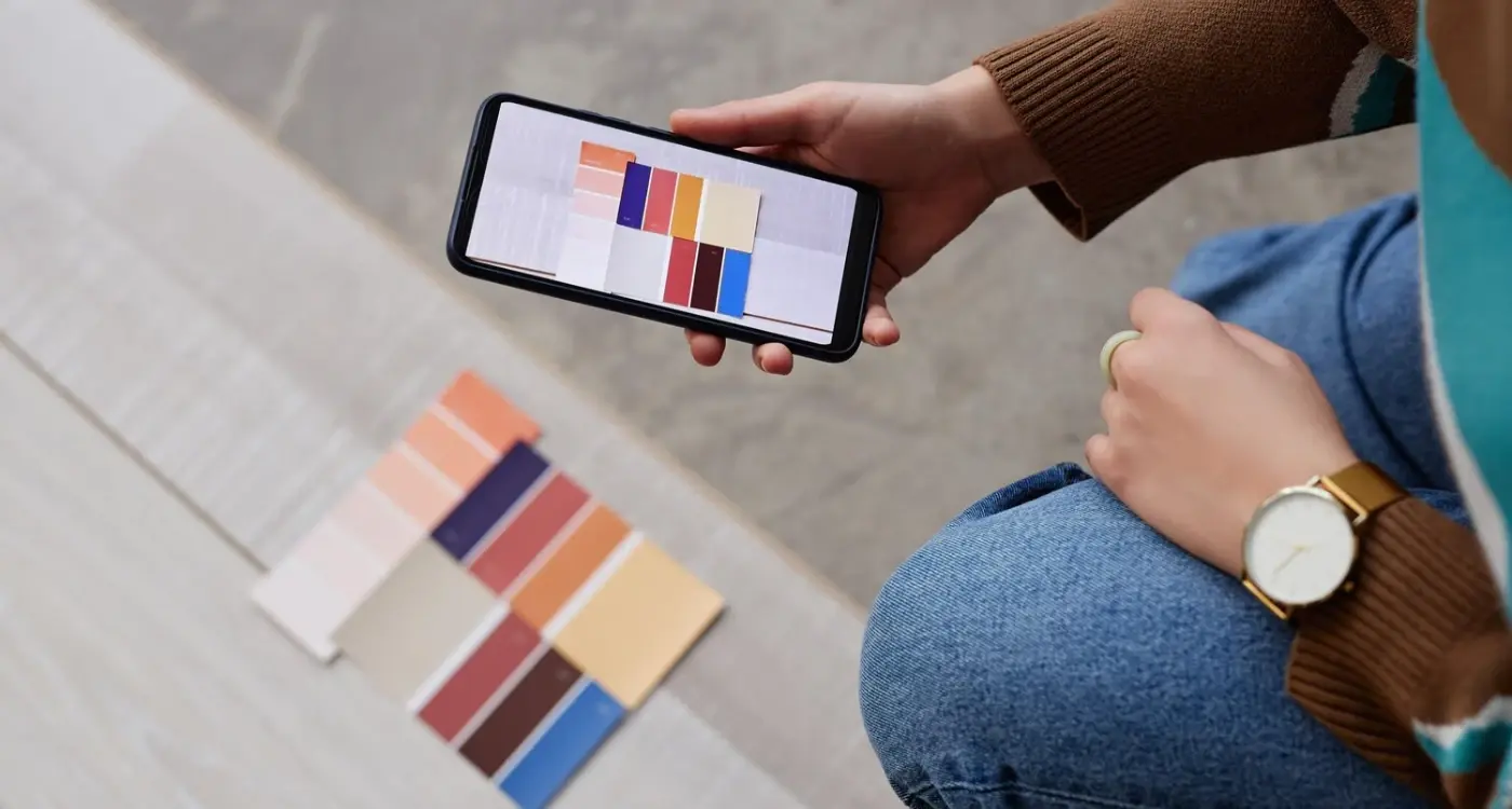
Colour schemes are where people really trip up. That electric lime green or deep purple gradient might look fresh now, but give it eighteen months and you'll cringe. I've learned to build colour systems around neutral bases—greys, whites, blacks—with accent colours that can be swapped out without rebuilding the entire design system. For an e-commerce client, we used a 60-30-10 rule: 60% neutral, 30% brand colour, 10% accent. When their brand evolved, we only needed to adjust that 40%. Understanding neuroscience-based design principles can also help you make colour choices that naturally appeal to users' cognitive preferences.
The Practical Approach to Timeless Design
Here's what actually works when building colour and type systems that last:
- Use 2-3 font weights maximum—Regular, Medium, Bold covers 95% of needs
- Build your colour palette with accessibility in mind from day one (WCAG AA minimum contrast ratios of 4.5:1 for text)
- Create semantic colour names like "primary", "success", "warning" rather than "blue" or "green" so you can swap them later
- Test your typography at actual device sizes, not just on your laptop screen
- Avoid pure black (#000000) for text; its too harsh—use dark greys like #1a1a1a instead
- Keep brand colours for accents and CTAs, not for entire backgrounds or large UI elements
The healthcare apps I've worked on taught me that readable, accessible design isn't just good practice... it's required by law in many cases. But even beyond compliance, users simply prefer apps they can read comfortably. A pharmacy app we designed uses nothing but system fonts and a blue-grey palette with orange accents, and it still looks fresh years later because we prioritised clarity over cleverness. That's the real secret—timeless design isn't about following trends, its about respecting how people actually use their phones.
Navigation Patterns Users Expect Right Now
Navigation is one of those things people don't notice when its done well, but bloody hell do they notice when its wrong. I've seen apps with brilliant features fail completely because users couldn't figure out how to get around them—and I mean genuinely useful apps that solved real problems. The navigation pattern you choose sets the entire tone for how people interact with your app.
Tab bars at the bottom remain the gold standard for iOS apps, and users expect to see between three to five main sections there. Anything more and you're asking people to squint; anything less and you might as well just use a different pattern altogether. Android users are more flexible with navigation drawers (the hamburger menu) but even that's shifting—most of my Android projects now use bottom navigation because people expect it. One healthcare app we rebuilt had a top navigation bar with nested menus, which tested terribly with users over 50. We switched to a simple four-tab bottom bar and engagement went up 40%. This kind of user engagement improvement often comes down to removing friction from the core experience.
The best navigation is invisible—users should focus on your content, not on figuring out how to move between screens
Gesture-based navigation is tricky. Sure, you can swipe between screens or use pull-down gestures, but these only work as secondary navigation methods. You need visible buttons as the primary way to move around because not everyone discovers gestures naturally. I learned this the hard way on an e-commerce app where we hid the cart behind a swipe gesture—conversion dropped like a stone until we added a proper cart icon. Mix gesture shortcuts with clear visual navigation and you'll keep both power users and casual users happy...well, happier at least.
The Role of White Space and Visual Breathing Room
White space is one of those design elements that clients always want to fill in—but here's the thing, some of the most successful apps I've built became successful partly because we resisted that urge. I worked on a fintech app where the original design crammed every screen with information, graphs and buttons because the client wanted users to "see everything at once". The result? Users couldn't find anything at once. When we redesigned it with proper spacing between elements, the engagement metrics went up by 40% within the first month.
The problem is that white space doesnt feel like design work to most people. It feels empty. But that's exactly its job—to give your users' eyes somewhere to rest and help them focus on what actually matters. When you look at apps that feel modern versus ones that feel dated, the difference is almost always in the spacing. Older designs pack everything tightly together because screen real estate felt precious back then; modern designs understand that attention is the precious resource. This is something that should be considered during the pre-design planning phase to avoid costly changes later.
How Much Space is Enough?
There's no magic number but I generally work with these guidelines based on projects that have performed well:
- Minimum 16-24px padding around screen edges (more on larger devices)
- 24-32px spacing between major content sections
- 8-16px spacing between related elements like text labels and input fields
- At least 44x44px touch targets with space around them to prevent mis-taps
I've seen healthcare apps where inadequate spacing led to actual user errors—patients selecting the wrong medication because buttons were crammed together. That's when white space becomes a safety issue, not just an aesthetic one. Sure, you might fit more content on screen by reducing margins, but if users cant process that content effectively then whats the point? The best designs guide the eye naturally from one element to the next without overwhelming people with visual noise.
Updating Icons and Visual Elements Without Starting From Scratch
The good news is you don't need to bin everything and start over—I've helped plenty of clients modernise their apps without the massive cost of a full redesign. The trick is knowing which visual elements have the biggest impact on perceived freshness. Icons are usually the quickest win; we replaced a fintech app's skeuomorphic icons (the ones that looked like real-world objects) with simplified line icons and immediately the app felt years younger. The whole icon refresh took less than a week and cost a fraction of what they'd budgeted.
Start with your primary action buttons and navigation icons because these are what users interact with most. You can swap out dated gradients for flat colours or switch heavily detailed icons for cleaner outline versions whilst keeping the same layout structure. I mean, there's no point changing everything if your existing navigation pattern still works well—its about refreshing not rebuilding. One healthcare app we worked on kept all their screens exactly where they were but updated button styles from glossy 3D effects to subtle shadows with better contrast ratios; users didn't even notice the navigation stayed the same but they definitely noticed it felt more modern. Understanding why design changes become expensive helps you plan these updates strategically.
Which Visual Elements to Update First
Here's the order I usually recommend based on what gives you the most visible improvement for the least effort:
- Primary and secondary buttons (these set the tone for your entire interface)
- Navigation bar icons and tab bar elements
- Loading states and progress indicators
- Form field styling and input elements
- Illustrations and empty state graphics
- Social proof elements like review stars or verification badges
The real question is whether your existing icon set needs tweaking or replacing entirely? If your icons are consistent with each other but just feel dated, you can often modernise them by adjusting stroke weights, simplifying details, or updating the colour palette. We did this for an e-commerce app where we kept the same icon concepts but reduced them from 3px strokes to 2px and removed unnecessary details—it made everything feel lighter and more contemporary without confusing existing users. Before making any changes, it's worth ensuring your development team has the technical capabilities to implement the updates efficiently.
Before you commission new icons, check if your current design system can be salvaged by simply updating colours and reducing visual complexity. I've seen projects save thousands by refining existing elements rather than starting from scratch—plus your users won't need to relearn where everything is.
The Technical Bits That Matter
Make sure any new icons or visual elements you introduce are vector-based (SVG for web, PDF for iOS, Vector Drawables for Android) so they scale properly across different screen sizes. I still see apps using raster images for icons which look awful on high-resolution displays... its a dead giveaway that the design hasn't been properly updated. Also, if you're updating colours, test them against WCAG accessibility guidelines; that trendy low-contrast grey text might look nice but it'll make your app harder to use and could actually fail accessibility standards in some regions.
When to Refresh vs When to Completely Redesign
This is probably the most expensive question you'll need to answer about your app, and getting it wrong can cost you tens of thousands of pounds. I've seen businesses waste money on complete redesigns when a refresh would've done the job, and I've watched others patch up designs that really needed to be ripped out and started fresh. The difference? It comes down to three things—your app's underlying structure, your user expectations, and how much technical debt you've accumulated over the years.
A refresh is what you need when your core navigation still makes sense and users can complete their main tasks without friction. Maybe your buttons look a bit dated or your colour palette feels tired, but the bones are good. I worked on a healthcare booking app that was performing well but looked like it was built when everyone still had iPhone 4s—we updated the typography, modernised the colours, added some breathing room, and users loved it. Cost about 15% of what a full redesign would've run. This approach helps avoid some of the ongoing expenses that come with major redesigns.
When You Actually Need to Start Over
A complete redesign becomes necessary when your app's fundamental structure is holding you back. If you're constantly explaining to new users how to find features, if your navigation doesn't match current platform conventions, or if you're trying to bolt on new functionality that your original design never accounted for... that's when you need to go back to the drawing board. I had a retail client whose app was organised around categories that made sense years ago but didn't reflect how people actually shopped anymore; no amount of visual polish would fix that underlying problem. The rebuild was expensive but their conversion rates jumped 40% within the first month because finally the app matched how people wanted to browse. Part of this success came from implementing dynamic content that adapted to user behavior rather than forcing everyone through the same rigid structure.
The Financial Reality Nobody Talks About
Here's what it actually costs—a visual refresh typically runs £8,000 to £25,000 depending on your app's complexity, and you can usually ship it in 6-8 weeks. A complete redesign? You're looking at £40,000 to £150,000+ and 4-6 months minimum, sometimes longer if you're rebuilding core functionality too. And here's the bit that catches people out: you'll need to update your marketing materials, retrain any customer service teams, and probably deal with some user complaints from people who liked the old version (it happens, trust me). Factor all that in before you decide which route to take. If you're wondering how to justify higher costs to stakeholders, focus on the long-term benefits of getting the design right rather than just the immediate price tag.
Conclusion
Look, keeping your app design fresh isn't about chasing every trend that pops up on Dribbble or redesigning your entire interface every six months. Its about understanding the fundamentals—good typography, thoughtful spacing, intuitive navigation—and applying them consistently. I've watched apps with modest budgets outlast their competitors simply because they focused on these basics and kept iterating in small, meaningful ways.
The apps I've worked on that have aged best? They're the ones where we built flexibility into the design system from day one. When we designed a fintech app a few years back, we created component libraries that could be updated independently; this meant when we needed to refresh the button styles or update the colour palette, we didn't need to rebuild everything. That modular approach saved the client thousands and kept their app looking current without the drama of a full redesign.
Here's what I want you to take away from this—your app design will age, that's inevitable. But aging doesn't have to mean looking outdated. Regular small updates beat massive overhauls every time. Watch your analytics, listen to user feedback, and don't ignore the signs when they appear. A dated design isn't just an aesthetic problem, it affects trust and conversion rates in ways that directly hit your bottom line.
Start with one area. Maybe its your onboarding flow or your navigation structure. Update it, test it, learn from it. Then move on to the next thing. This gradual approach keeps your app feeling current without disrupting your users or draining your budget. And honestly? That's how the best apps in the store stay relevant year after year—not through grand redesigns, but through consistent attention to detail and a genuine commitment to serving their users better.
Frequently Asked Questions
Based on my experience working with apps across different sectors, you don't need major updates more than every 2-3 years if you're doing regular small refreshes. I typically recommend quarterly reviews of key elements like buttons and icons, with annual assessments of navigation patterns to catch any drift from current platform conventions.
The most expensive mistake I see is doing complete redesigns when a visual refresh would suffice—I've watched clients spend £100k+ unnecessarily this way. Before changing everything, test whether your core navigation still works well and users can complete their main tasks without friction; often you just need updated colours, typography, and spacing rather than rebuilding from scratch.
Compare your app side-by-side with the top 3 apps in your category that were updated in the last 12 months—if yours looks noticeably different in terms of button styles, spacing, or navigation patterns, that's your first clue. Also check if you're still using hamburger menus as primary navigation, heavily detailed icons, or gradient-heavy buttons, as these are dead giveaways of older design approaches.
Users rarely complain directly about outdated design, but it shows up in your metrics—I've seen conversion rates improve by 20-40% after design refreshes even when the app was "working fine." Your design competes against every other app users open that day, and if yours feels notably different in the wrong ways, it affects trust and engagement even if people can't articulate why.
From rebuilding apps that aged poorly due to trendy choices, I'd recommend sticking with system fonts (SF Pro for iOS, Roboto for Android) and building colour systems around neutral bases with swappable accent colours. I've seen apps look dated within 18 months because they chased unique typography or bold colour palettes that couldn't evolve with the platform—timeless design prioritises readability over distinctiveness.
Start with your primary buttons and navigation icons, as these have the biggest impact on perceived freshness—I've helped clients modernise their entire app feel for under £15k just by updating these key elements. Focus on replacing any skeuomorphic elements with cleaner alternatives, improving spacing between elements, and ensuring your colour palette meets current accessibility standards before considering larger structural changes.
If your core navigation still makes sense and new users can complete main tasks without confusion, you likely need just a refresh (£8k-25k, 6-8 weeks). But if you're constantly explaining how to find features, your navigation doesn't match current platform conventions, or you're trying to add functionality your original design never accounted for, that's when you need a complete redesign (£40k-150k+, 4-6 months minimum).
In my experience, users adapt quickly to visual updates like colour changes and button styling, but struggle with navigation restructures—that's why refreshes work so well. I always recommend keeping successful navigation patterns intact while updating the visual layer; one healthcare app we refreshed kept all screens in the same places but modernised the styling, and users noticed it felt fresher without any confusion about functionality.
Share this
Subscribe To Our Learning Centre
You May Also Like
These Related Guides

How Do I Make My Wellness App Accessible For People With Disabilities?

Should My App Look the Same on Every Screen?