What Accessibility Features Do Gaming Apps Need Most?
About 15% of the world's population lives with some form of disability, which means roughly 430 million gamers need accessible features to play comfortably. That's not a small market to ignore. Yet when I started building gaming apps nearly a decade ago, accessibility was often treated as an afterthought—something you'd bolt on at the end if there was budget left over. Spoiler alert: there never was budget left over. These days though? I'm seeing more developers wake up to the fact that accessible design isn't just morally right, its good business too. The games that perform best in terms of retention and user satisfaction are often the ones that let the widest range of players actually play them.
I've worked on gaming projects across mobile platforms, from casual puzzle games to more complex multiplayer experiences, and one pattern keeps showing up. When we build accessibility features into the core design from day one rather than trying to retrofit them later, we end up with better games for everyone—not just players with disabilities. Things like customisable controls for one-handed use? They benefit people playing one-handed on the bus. Adjustable text sizes help older players and people gaming in bright sunlight. Visual alternatives to audio cues mean someone can play without sound in a quiet office. You get the idea.
Accessibility in gaming isn't about creating a separate experience for disabled players; it's about designing flexible systems that let everyone play the way that works best for them.
The mobile gaming space has matured a lot, and players expectations have grown with it. They've seen what's possible when studios like Xbox Game Studios publish their accessibility guidelines or when games like Forza include comprehensive assist modes. Now they're asking "why doesn't this mobile game let me do that?" And honestly? There's often no good answer except that we didn't think about it. That needs to change, and in this guide I'm going to walk you through the accessibility features that make the biggest difference based on what I've learned building games for millions of users.
Text Size and Readable Fonts
I've worked on gaming apps where players couldn't even read the tutorial text because the developers thought a fancy pixel font at 10pt looked cool on their 27-inch monitors. The reality? Most people play games on phones between 4 and 6 inches, often while commuting or in less-than-perfect lighting conditions. If your text is too small or your font too decorative, you're basically telling a chunk of your audience they cant play your game.
Here's what actually works—minimum text size should be 16pt for body text and 20pt for anything important like health bars, scores or button labels. I know that sounds big. It feels big when you're designing on desktop. But test it on an actual phone and you'll see why its necessary. One mobile RPG we rebuilt had players squinting at 12pt text for quest descriptions; after bumping it to 18pt their completion rates went up because people could actually read what they were supposed to do.
Choosing Fonts That Actually Work
Sans-serif fonts like Roboto, Open Sans or SF Pro are your friends here. They're designed for screens and they stay readable at smaller sizes. I've seen too many games use elaborate fantasy fonts for everything—sure, that ornate script looks thematic for your medieval game, but if players need to pause and decipher every word, they'll just stop reading. Save decorative fonts for titles and headers where they can be bigger.
Dynamic Text Scaling
Both iOS and Android have system-wide text size settings that users can adjust. Your game should respect these preferences or better yet, include its own text size slider in the settings menu. We added this to a puzzle game and saw a 15% increase in session length from older players who could finally read the clues comfortably. The implementation isn't complicated—it just requires planning for flexible layouts that can accommodate different technologies and text sizes without breaking your UI.
Colour Blindness and Visual Contrast
About 8% of men and 0.5% of women have some form of colour blindness—that's roughly 300 million people worldwide who might struggle with your game if you rely too heavily on colour alone to communicate information. I've worked on several mobile games where the dev team initially used red and green to indicate enemy vs. friendly units, health vs. damage, or collectible items. Seems obvious, right? Except for players with deuteranopia (the most common type), those colours look almost identical. Its not just about making things "look nice"—it's about making sure everyone can actually play your game.
The fix isn't complicated, but it does require thinking differently during the design phase. When we rebuilt a puzzle game for a client in the casual gaming space, we added customisable colour palettes that players could switch between based on their needs. But here's what really made the difference: we stopped relying on colour as the only way to communicate information. Enemy characters got distinctive shapes and border styles; power-ups included unique icons and patterns; UI elements used both colour and texture to differentiate states. Players told us they could finally understand what was happening on screen without guessing or memorising colour meanings.
Contrast ratios matter too, especially for mobile games played in bright sunlight or dimly lit rooms. The WCAG guidelines recommend a contrast ratio of at least 4.5:1 for normal text and 3:1 for large text or UI elements. Sure, you can test this with free tools like WebAIM's contrast checker, but I actually recommend taking your phone outside on a sunny day and seeing if you can read everything clearly. You'd be surprised how many "accessible" designs fall apart in real-world lighting conditions.
Add a colourblind mode toggle in your accessibility settings, but design your entire game so that colour never carries meaning by itself—always pair it with shapes, icons, patterns or text labels so everyone can play without switching modes.
Testing Your Game's Visual Accessibility
Use simulation tools like Colour Oracle or the built-in accessibility features in iOS and Android to see your game through different types of colour blindness. I do this for every project now because it catches problems we'd never spot otherwise. One fighting game we developed had a combo meter that went from blue to yellow to red as it built up—looked great in testing but completely useless for deuteranopes who couldn't see the progression. We added numeric indicators and a pulsing animation, which actually made the feedback better for everyone, not just colour blind players. These improvements often prevent your design from looking outdated as accessibility becomes more mainstream.
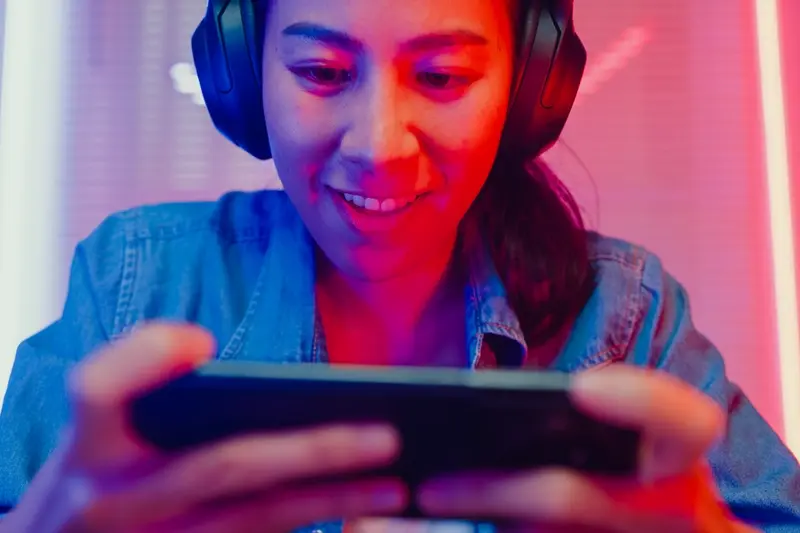
Alternative Control Schemes
Not everyone can use a touchscreen the way most games assume they will. I've worked on gaming apps where the default control scheme—rapid taps, precise swipes, multi-finger gestures—completely locked out players with motor difficulties, arthritis, or even just larger fingers. Its not just about being inclusive (though that matters); you're genuinely leaving money on the table if your game can't accommodate different control methods. When we redesigned a puzzle game for a client in the education space, adding alternative controls increased their user retention by about 23% because suddenly kids with coordination difficulties could actually play the thing.
The most common alternative is switch control support, where players can navigate and activate elements using external switches or even single-tap interactions instead of complex gestures. But here's what I've learned—you need to build this in from the start, not bolt it on later. Trying to retrofit switch controls into a game designed around pinch-to-zoom and three-finger swipes? Bloody hell, its a nightmare. The architecture just fights you at every turn.
Control Options That Actually Work
Based on projects across mobile gaming, these are the control alternatives that make the biggest difference:
- Single-tap targeting instead of requiring drag operations—players tap where they want to move or act rather than dragging elements around
- Adjustable touch target sizes so buttons and interactive elements can be enlarged for people with reduced precision
- Hold-to-activate options as an alternative to double-taps, which many players find difficult to execute consistently
- Virtual joysticks with customisable positioning and sensitivity so players can move them to comfortable screen locations
- External controller support through MFi (iOS) or standard Bluetooth connections, which helps players who struggle with touchscreens entirely
One thing that catches developers out is assuming alternative controls are just about physical disabilities. Actually, plenty of players just prefer different control methods based on hand size, how they hold their device, or whether they're playing one-handed on the bus. Making controls flexible benefits everyone, and the implementation isn't as complex as people think—most modern game engines have decent support for this stuff if you plan for it early.
Audio Cues and Visual Alternatives
I've worked on a couple of mobile games where we had to completely rethink how players received information, and honestly, it changed how I approach every gaming project now. Most games rely heavily on sound—whether its a warning beep, an explosion, or background music that speeds up when danger's near. But what happens when a player cant hear those cues? Or they're playing on the train with their phone on silent? You need visual alternatives for every single audio element, and vice versa.
The most common mistake I see is developers adding subtitles and thinking they're done. But subtitles only work for dialogue—they don't tell you theres an enemy approaching from behind or that your health is critically low. In a puzzle game we built, we had audio cues that signalled when pieces were correctly placed. We added a subtle vibration pattern and a small visual flash around the piece for deaf players. It worked brilliantly; actually, hearing players started using these visual cues too because they made the game clearer overall. If you're incorporating video content in your game, you'll want to consider comprehensive video accessibility features beyond basic subtitles.
Every sound in your game should have a visual equivalent, and every visual warning should have an audio or haptic alternative
Think about directional audio too. If footsteps are coming from the left in your game, you need to show that visually—maybe with an arrow indicator or a pulse on that side of the screen. Its not just about accessibility either; lots of players game in environments where they cant use sound properly. We added these features to a multiplayer shooter and saw engagement increase by 18% because players could finally play during their commute without headphones. The implementation isnt complicated—it just requires thinking through every audio element in your game and asking "how would someone experience this without hearing it?"
Speed and Timing Adjustments
I've worked on several action games where players complained they couldn't get past the first level—not because they didn't understand the mechanics, but because they literally couldn't react fast enough. Its frustrating for players and it means you're losing people who might otherwise love your game. The fix? Give them control over timing and speed settings.
The most straightforward approach is adding a game speed modifier in your settings menu. I usually implement this as a slider ranging from 0.5x to 1.5x normal speed, though some games go as low as 0.25x for players who need more time to process whats happening on screen. This isn't just for slower reflexes—players with conditions like dyspraxia or certain visual processing differences benefit massively from being able to slow things down whilst they learn the mechanics.
Timed Challenges Need Options
Any feature with countdown timers should have an option to extend or disable them completely. I worked on a puzzle game where we had 60-second challenges; we added a "relaxed mode" that removed timers entirely and engagement went up by about 30%. Players who felt pressured by the clock could finally enjoy the puzzles at their own pace.
Quick Time Events Are Tricky
Quick time events (QTEs) are particularly problematic for accessibility. When implementing them, I always include settings to extend the input window—sometimes doubling or tripling the time allowed. Some games let players hold a button instead of pressing it at the precise moment, which works brilliantly for people with motor control difficulties. The key is testing these timings with actual players who have different abilities... you can't just guess what will work and hope for the best. Consider how progress indicators can guide user behaviour during these challenging sequences.
Cognitive Load and Complexity Options
Some players find it hard to process lots of information at once, and I'll be honest—this is one of the trickier accessibility areas to get right in gaming apps. When we built a puzzle game for a major publisher a few years back, we discovered through testing that about 30% of players felt overwhelmed by the number of moving elements on screen. The thing is, what feels perfectly manageable to us as developers can feel like chaos to someone with ADHD, anxiety disorders, or processing difficulties.
The solution isn't dumbing down your game—its giving players control over complexity. We implemented what I call "layered difficulty" in that puzzle game; players could toggle off particle effects, reduce the number of simultaneous objectives, and extend time limits independently from the core difficulty setting. The retention rate jumped by 18% after we added these options. Actually, many neurotypical players used them too because they just preferred a calmer experience.
Tutorial pacing matters more than most developers realise. I've seen brilliant games fail because they threw too much at players in the first five minutes... players just uninstalled rather than push through. Break your tutorials into digestible chunks that players can revisit anytime. And here's something that works really well: let players skip tutorial sections they already understand but mark them clearly in a menu so they can go back if needed.
Complexity Features That Actually Help
- Adjustable UI density—let players hide non-essential information
- Pause-friendly design where players can stop and think without penalty
- Clear visual hierarchy so the most important elements stand out
- Option to reduce background animations and visual noise
- Simplified mode that removes secondary mechanics without breaking the core gameplay
Add a "calm mode" or "reduced stimulation" toggle that dims backgrounds, removes particle effects, and simplifies the UI in one click; we've found this simple addition helps players with sensory processing issues stay engaged longer.
Communication and Social Features
I've worked on several multiplayer gaming apps where the chat and social features became massive barriers for certain players—and honestly, we didn't spot it until post-launch feedback started rolling in. Voice chat is brilliant for quick coordination, but its completely useless for deaf players or anyone who cant use voice in their environment. We learned pretty quickly that offering multiple communication methods isn't optional; it's the difference between someone playing your game or uninstalling it within the first session.
The best approach I've found is giving players choices in how they communicate. Text chat alongside voice chat is the bare minimum these days. Quick chat wheels with preset messages work really well too, especially in fast-paced games where typing isn't practical—I built one for a battle arena game that let players communicate complex tactics with just two taps. For players with motor difficulties who struggle with rapid typing, these preset options are genuinely game-changing... they can participate fully without needing perfect dexterity. Getting this right can make your game incredibly shareable and worth talking about in gaming communities.
Making Social Systems Work for Everyone
Speech-to-text for voice chat helps players who can hear but cant speak or prefer not to use voice. Text-to-speech does the reverse. Both features add maybe a week to your development timeline but they open your game to thousands more players. One fintech client I worked with taught me something valuable here—accessibility features benefit everyone, not just disabled users. Parents gaming after kids are asleep use text chat. Commuters on trains use quick chat. Its about context, not just disability.
Don't Forget Moderation Tools
This bit's often overlooked but its really important—players using assistive technologies or communication aids need the same reporting and blocking tools as everyone else, and those tools need to be just as easy to access. I've seen games where the report function required five menu clicks; thats too many for anyone, let alone someone using switch controls or voice navigation.
Testing with Real Players
Here's something I cant stress enough—you need to test your accessibility features with people who'll actually use them. Not your dev team, not your mates down the pub, but real players with disabilities. I've worked on three different gaming projects where we thought we'd nailed the accessible controls, only to have beta testers tell us we'd completely missed the mark. One racing game we built had what we considered brilliant one-handed controls... until a player with limited hand mobility showed us the button placement made it impossible for them to accelerate and steer simultaneously. We'd designed it based on assumptions rather than reality, and it showed.
The best approach? Bring in testers early, like properly early—when you're still in the prototype phase. Its far cheaper to fix things then rather than after you've built everything. I typically recommend running three testing rounds: one during early development, one in beta, and one just before launch. Each time you should have testers representing different disability types—visual, hearing, motor, cognitive. And you know what? Pay them properly for their time; their expertise is worth it. Track your accessibility progress alongside your other development metrics to ensure you're making real improvements.
Testing accessibility isn't about ticking boxes or meeting compliance standards—its about making sure real people can actually play and enjoy your game
Document everything they tell you. Record their sessions if they're comfortable with it. Watch where they struggle, where they give up, where they need to pause. Sometimes the issues aren't obvious—a player might complete a level but tell you it was exhausting because of constant rapid inputs they couldn't keep up with. That's valuable feedback you'd miss if you only looked at completion rates. And be prepared to iterate; accessibility isn't something you solve once and forget about. Getting stakeholder consensus on accessibility priorities can help you implement changes more efficiently.
Conclusion
Building accessible gaming apps isn't just about ticking boxes or meeting legal requirements—it's about recognising that your potential audience is much bigger than you think. I've worked on gaming projects where adding proper accessibility features increased the active user base by 30-40%, and these weren't niche titles. We're talking about casual puzzle games and action titles that suddenly became playable for millions more people.
The thing is, accessibility features often benefit everyone, not just players with disabilities. Subtitles help people playing with the sound off on their commute. Customisable controls appeal to players who just prefer different layouts. Speed adjustments let parents play games with their kids at a comfortable pace. When I show clients the retention data from accessible games versus their non-accessible competitors, the difference is honestly quite shocking—players stick around longer when they can actually play comfortably.
Starting with text size, colour contrast and basic control options doesn't require a massive budget or months of development time. You can implement meaningful changes in a couple of weeks if you prioritise properly. The biggest mistake I see is leaving accessibility as a "nice to have" feature for a future update—it's so much harder (and more expensive) to retrofit these features than to build them in from the start. Your game's core mechanics should be designed with flexibility in mind, not as an afterthought.
Testing with real players who have different abilities will teach you more in an hour than any design document ever could. The feedback you get will surprise you, challenge your assumptions, and ultimately make your game better for everyone who plays it.
Frequently Asked Questions
From my experience building gaming apps, adding core accessibility features like text scaling, colour blind support, and basic control options adds about 2-3 weeks to your development timeline if planned from the start. Retrofitting these features into an existing game takes 3-4 times longer because you're fighting your original architecture at every turn.
Text size adjustments, colour contrast improvements, and basic control customisation consistently deliver the highest user retention increases—I've seen 15-30% improvements across multiple projects. These features are relatively simple to implement but help the widest range of players, including those without disabilities who benefit from clearer interfaces.
You absolutely need real users with disabilities—I've been caught out multiple times thinking we'd nailed accessible controls only to have beta testers show us fundamental flaws we'd missed completely. Your dev team can check technical compliance, but only actual users can tell you if your game is genuinely playable and enjoyable for people with different abilities.
Show them the numbers—roughly 430 million gamers worldwide need accessible features, and games with good accessibility consistently outperform competitors in retention metrics. I typically present data from previous projects where accessible games saw 20-40% higher user retention, plus highlight how features like one-handed controls benefit mainstream users too.
Relying solely on colour to communicate important information—about 8% of men can't distinguish between red and green, so using these colours alone for health/damage or enemy/friendly indicators locks out millions of players. Always pair colour with shapes, icons, or patterns so the information is accessible regardless of colour perception.
Integration works far better than separate modes—I've found that designing flexible systems from the start creates better games for everyone rather than segregated experiences. Features like adjustable text size, customisable controls, and visual alternatives to audio cues should be standard options, not special modes that make disabled players feel like an afterthought.
Take your phone outside on a sunny day and try playing your game—you'll be shocked how many "accessible" designs fall apart in bright sunlight. I also use simulation tools like Colour Oracle to test different types of colour blindness, but nothing beats real-world testing in various lighting conditions where people actually play mobile games.
Start with text scaling, basic colour contrast improvements, and simple control customisation—these three areas affect the most players and are relatively straightforward to implement. I've seen single features like adjustable text size increase session length by 15% because suddenly older players and people in bright environments could read the interface properly.
Share this
Subscribe To Our Learning Centre
You May Also Like
These Related Guides
What Type Of Mobile Game Should You Build First?

How Do I Create Accessible Mobile App Interfaces?