
What Happens When Accessibility Conflicts With My App Design?
Music streaming apps have this thing where they love dark interfaces with subtle grey text overlaid on album artwork. Looks gorgeous in screenshots. But here's what happens in reality: someone with moderate vision impairment opens the app, can't read half the text on screen, and switches to Spotify instead. I've seen this exact scenario play out with a music app we worked on—the design team had created these beautiful, minimalist screens that fell apart the moment we ran accessibility tests. The client was convinced they'd have to throw out all their design work and start from scratch with something "boring". They didn't, but it took some proper thinking to get there.
The tension between accessibility and design isn't new, but its become way more pressing as regulations tighten and users (rightly) expect better. What people don't realise is that accessibility requirements aren't optional anymore; they're legally required in many markets, and the App Store algorithms actually factor in accessibility compliance when ranking apps. I've watched apps get rejected for contrast issues alone. But the other side? Design isn't just about making things pretty—good design communicates hierarchy, guides attention, and creates emotional connections with users. When accessibility rules seem to clash with those goals, designers panic.
The assumption that accessible design means ugly design is probably the most expensive misconception in mobile development
Most conflicts between accessibility and design come from a fundamental misunderstanding of what accessibility actually requires. Designers think it means abandoning their colour palettes or making everything massive and clunky. It doesn't. What it does mean is designing with constraints—real ones based on how diverse users actually interact with their devices. Some people navigate entirely by voice. Others need high contrast modes or larger touch targets. The challenge isn't choosing between beautiful and accessible; its finding solutions that serve both needs simultaneously, which is absolutely possible if you approach it right from the start.
Understanding Where Accessibility and Design Really Clash
The biggest tension I see between accessibility and design happens when clients show me their beautiful mockups with thin grey text on white backgrounds, minimal touch targets, and gesture-based navigation that relies entirely on swiping. Its not that designers are being difficult—they genuinely want to create something that looks modern and clean. But here's the thing, what looks minimal and elegant often creates real problems for users with visual impairments, motor control difficulties, or cognitive disabilities.
I worked on a fintech app where the design team had created these gorgeous data visualisations using subtle colour gradients to show account balances and spending patterns. Looked fantastic in the presentations. But when we ran it through accessibility checks? The colour contrast ratios failed spectacularly, and users who were colour blind couldn't distinguish between different account types at all. We had to rethink the entire approach, adding patterns and icons alongside the colours. Did it look slightly different to the original vision? Sure. Was it still a good looking app that more people could actually use? Absolutely.
The conflicts tend to pop up in predictable areas that you need to plan for from the start:
- Minimum touch target sizes (44x44 pixels on iOS) versus designers wanting tiny, elegant buttons
- Text size requirements versus carefully balanced typography hierarchies
- High contrast ratios versus subtle, sophisticated colour palettes
- Clear labelling for screen readers versus minimal interface design
- Animation and motion effects versus users with vestibular disorders
The good news? These conflicts aren't really conflicts at all once you understand that accessibility constraints are just design constraints like any other. I mean, you wouldn't design an app that doesn't work on smaller screens, would you? Accessibility works the same way—its about designing for the full range of human capability, not just the ideal user you have in your head. This is particularly crucial when considering mobile app ergonomics and how users actually interact with their devices in real-world scenarios.
The Most Common Accessibility Requirements That Challenge Visual Design
Let me be honest with you—some accessibility requirements can feel like they're working against your design vision. And I get it, because I've been there countless times, explaining to clients why their beautiful gradient text needs reworking or why that subtle grey-on-white colour scheme just wont cut it.
The biggest challenge? Text size and scalability. When we built a banking app a while back, the designer had created this lovely compact interface with small, elegant typography. Problem was, when users bumped up their system font size (which millions of people do), everything broke. Text overlapped, buttons got cut off, and the whole layout fell apart. We had to redesign with flexible containers that could adapt, which meant more white space and less content per screen than the original vision. It wasnt what the designer wanted, but it's what real users needed. This is also where future-proofing your design decisions becomes crucial for long-term success.
The Requirements That Trip Up Most Designs
Here's what I see causing headaches on almost every project:
- Colour contrast ratios of 4.5:1 for normal text and 3:1 for large text—this rules out loads of trendy colour combinations
- Touch targets needing to be at least 44x44 points on iOS and 48x48dp on Android, which eats up screen real estate fast
- Text needing to reflow properly when users increase font sizes up to 200%
- Interactive elements requiring visible focus states that can clash with minimal design aesthetics
- Icon-only navigation needing text labels, which takes up more space than designers typically want
- Animations and auto-playing content needing pause controls for users with vestibular disorders
Design your layouts with 150-200% text scaling from day one, not as an afterthought. I've seen teams waste weeks retrofitting designs because they tested at default sizes only.
The healthcare apps I've worked on have taught me that these requirements aren't arbitrary—they exist because people genuinely struggle without them. But that doesnt make them any less challenging to implement whilst keeping your app looking modern and polished. This is why designing for specialized user groups requires thinking beyond conventional design approaches.
Why Beautiful Apps Can Still Be Accessible Apps
There's this weird myth floating around that accessible apps have to look boring or clinical, like they're stuck in some early 2000s design time warp. I've heard it from clients more times than I can count—they worry that adding accessibility features will turn their sleek fintech app into something that looks like it was designed for a government website. But here's the thing: some of the most visually stunning apps I've built have been the most accessible ones too.
I worked on a healthcare app a few years back where the client was convinced they'd have to sacrifice their brand identity to meet WCAG standards. They had this gorgeous colour palette—deep purples and teals—and were worried contrast requirements would force them into stark blacks and whites. What we actually did was keep their colours exactly where they mattered most (large brand elements, illustrations, background gradients) but used higher-contrast variations for the functional bits like buttons and text. The app ended up winning a design award and scoring perfectly on accessibility audits. Both things can be true at the same time.
The secret is understanding that accessibility isn't about limiting your design; its about making intentional choices. Dynamic type support doesn't mean your layouts fall apart—it means you design flexible systems from the start. VoiceOver compatibility doesn't ruin your custom animations—it just means those animations need proper labels and shouldn't be the only way to convey information. I've seen apps with absolutely beautiful motion design that work perfectly for screen reader users because the designer thought about both experiences from day one, not as an afterthought. When you treat accessibility as a design constraint rather than a checklist you bolt on at the end, it actually pushes you to make better design decisions overall. This is part of what keeps apps from looking outdated and maintains their visual appeal over time.
Making Typography Work for Everyone Without Compromising Style
Typography choices cause more friction between design teams and accessibility requirements than almost anything else I deal with. Designers want that sleek condensed sans-serif at 14px, whilst WCAG guidelines are basically telling you to go bigger and bolder. But here's the thing—I've built apps for financial institutions where regulatory compliance wasn't optional, and we still managed to create interfaces people actually wanted to use.
The minimum text size debate is a bit mad really, because its not actually about picking one magic number. I've found that 16px works brilliantly for body text on most mobile screens, but context matters more than you'd think. A healthcare app I worked on needed medication instructions to be crystal clear, so we went with 18px base size and the design team initially pushed back hard. They thought it would look childish. It didn't—it looked confident and trustworthy, which is exactly what patients needed when reading dosage information at 3am.
The apps that succeed with accessible typography aren't the ones that treat it as a constraint but as a design parameter worth mastering
Line height is where you can actually win back some visual breathing room. I typically use 1.5 for body text (sometimes 1.4 if the typeface has generous spacing already) and this makes a massive difference for people with dyslexia or visual impairments. Letter spacing too—adding just 0.12em can improve readability without making your design look clunky. And weight matters more than size sometimes; a medium weight font at 16px often tests better than a light weight at 18px because the stroke definition helps with character recognition.
Dynamic type on iOS and font scaling on Android aren't optional anymore, they're expected. Sure, it means your perfectly aligned layouts might break when someone cranks their text size up to 200%, but you know what? That's their choice to make, not yours. I always build with a maximum comfortable scale of around 250% and use relative spacing units so everything grows proportionally.
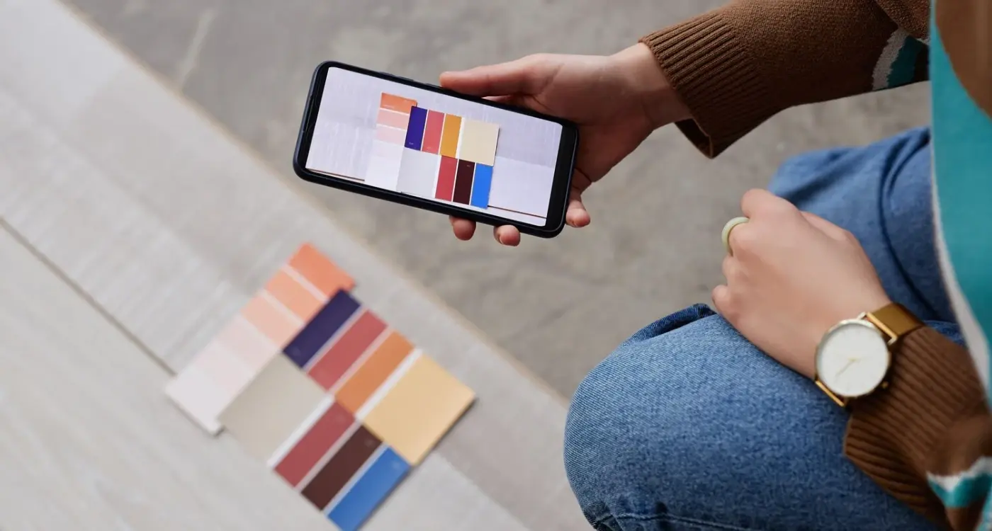
Colour Contrast Rules and How to Work Within Them
The contrast ratio requirements sound simple on paper—4.5:1 for normal text and 3:1 for large text—but working with them day in and day out has taught me they're more flexible than most designers think. I've built apps for healthcare companies where lives literally depend on users reading medication instructions clearly, and I've worked on fashion retail apps where brand colours seemed non-negotiable. Both can meet accessibility standards, but you need to know where the wiggle room is.
Here's what most design teams get wrong; they test their colour choices once during the design phase and never look at them again. But contrast ratios change depending on screen brightness, ambient lighting, and even the specific device displaying your app. I always test colour combinations on actual devices in different lighting conditions—not just on my desktop monitor. That grey text that looks fine in your air-conditioned office? It's unreadable on a phone screen in direct sunlight.
Working With Brand Colours That Don't Meet Standards
When a client's brand blue fails contrast tests (and trust me, it happens constantly), I don't just tell them to pick a different blue. Instead, I show them where we can use their exact brand colour—in illustrations, icons, decorative elements, and large headings—and where we need to adjust the shade slightly for body text. Most brands have multiple colour variations anyway; we just need to be strategic about which one goes where. I built an app for a fintech company whose signature teal was their entire identity, but their text colour failed every contrast test. We kept the teal for all the visual brand elements and navigation, but darkened it by about 15% for text-heavy screens. Users never noticed the difference, but readability improved massively.
Using Colour Contrast Tools That Actually Help
I use WebAIM's contrast checker dozens of times during every project—its free, fast, and tells you exactly what ratio you've achieved. But don't just aim for the minimum; if you're hitting exactly 4.5:1, you're probably still going to get complaints from users. I aim for at least 5:1 or higher for any text that matters. And here's something I learned the hard way... dark mode completely changes your contrast calculations. That colour scheme that works perfectly in light mode might fail spectacularly when users switch to dark mode, so you need to test both scenarios separately.
Navigation Patterns That Look Good and Work for All Users
Navigation is where I see the biggest disconnect between accessibility and design. Designers love hidden menus, gesture-based controls, and minimalist interfaces with barely-there navigation elements—and I get it, they look gorgeous. But here's what I've learned building apps for banks and healthcare providers: if users cant figure out how to move around your app, none of that beautiful design matters. The good news? You don't have to choose between the two.
The tab bar is your friend, honestly. It might seem boring compared to fancy hamburger menus or swipe gestures, but its accessible by default and users know exactly what to do with it. When I worked on a fintech app that initially had a slide-out menu, our accessibility audit showed screen reader users were getting completely lost—they'd navigate through dozens of elements just to find the menu button. We switched to a bottom tab bar and retention improved across all user groups, not just those using assistive tech. Sometimes the "boring" solution is actually the smart one. This is especially important when considering long-term app relevance and user retention.
Always provide multiple ways to navigate—tabs, search, and clearly labeled back buttons. If you're using gestures (like swiping between screens), make sure there's a visible button alternative. I've seen too many apps rely solely on swipe gestures that assistive tech users simply cannot access.
Navigation Elements That Actually Work
- Tab bars with clear icons AND text labels (not just icons, as tempting as that is)
- Touch targets at least 44x44 points—yes, this means bigger buttons but users wont accidentally tap the wrong thing
- Consistent placement of navigation elements across all screens
- Skip links for screen reader users to bypass repetitive navigation
- Breadcrumb trails for complex hierarchies in e-commerce or content apps
One pattern that works brilliantly is combining a persistent bottom navigation with a clearly labeled "More" option for secondary features. An e-commerce app I worked on used this approach and we could fit the four most-used sections in the tab bar whilst keeping the interface clean. Users with motor control difficulties told us during testing that having those large, consistent tap targets made shopping so much easier than competing apps with hidden menus.
Testing Your Design With Real Accessibility Needs
I'll be honest, the first time I ran proper accessibility testing on an app I thought was perfectly designed, I was a bit gutted by what we found. We'd built this gorgeous fintech dashboard with all these lovely animations and gesture controls, and when we brought in users with actual accessibility needs to test it—well, lets just say the screen reader experience was a complete mess. Things that looked brilliant visually made absolutely no sense when announced aloud, and some of our clever swipe interactions were impossible for users with motor impairments to complete.
The thing is, you cant really know if your design works for everyone until you test it with everyone. And I mean genuinely test it, not just run it through an automated checker (though those are useful too, dont get me wrong). We now bring in testers who use VoiceOver, TalkBack, and Switch Control during the design phase—not after launch when its expensive to fix. Its amazing what you learn when you watch someone navigate your carefully crafted interface in ways you never anticipated. This type of testing requires thoughtful research planning but doesn't need to break your budget.
What Actually Works in Real Testing
For a healthcare app we built, we tested with users who had low vision, motor impairments, and cognitive disabilities. The automated tools flagged about 40 issues; actual users found over 100. Things like tap targets being technically large enough but positioned too close to scrollable areas, or colour combinations that passed WCAG ratios but still caused strain during extended use. We also discovered that our "helpful" animation transitions were making some users genuinely nauseous, which no automated tool would ever catch.
Setting Up Testing That Actually Helps
You dont need a massive budget for this. Start by enabling accessibility features on your own devices and using your app for a full day with VoiceOver turned on or while wearing vision-impairment simulation glasses. Its uncomfortable and frustrating—which is exactly the point. Then, recruit actual users through accessibility organisations or user testing platforms that specialise in inclusive research. Even three or four sessions will reveal problems you'd never spot otherwise. Record the sessions (with permission) so your whole team can watch; theres nothing quite like seeing someone struggle with your interface to motivate proper fixes. This kind of user feedback is also crucial for building stakeholder consensus around necessary changes.
Conclusion
After years of building apps for banks, healthcare providers, and retail brands, I can tell you this with complete certainty—accessibility and great design aren't enemies. They're just different priorities that need to be balanced, and honestly? The apps that manage to do both well are the ones that end up performing better across the board. Its not just about doing the right thing (though that matters too), its about creating apps that more people can actually use and enjoy.
The thing I've noticed is that accessibility constraints often push designers to be more creative, not less. When you cant rely on colour alone to convey information, you start thinking about icons, patterns, and hierarchy in ways you might have skipped otherwise. When you need to maintain proper contrast ratios, you learn which colour combinations genuinely work and which ones you were using just because they looked trendy. I've seen design teams initially push back on accessibility requirements, only to realise months later that those same requirements made their app clearer for everyone—not just users with disabilities.
The biggest mistake I see is treating accessibility as something you bolt on at the end. It never works. You end up compromising both the design and the accessibility, and you waste time fixing things that could have been built right from the start. Start with accessibility in your design process and you'll find it shapes your decisions in ways that actually improve the overall experience. Test early with real users who have different needs. Use the accessibility tools built into iOS and Android throughout development, not just before launch. And remember that accessible design is good design—full stop. The apps I'm proudest of are the ones that look beautiful and work brilliantly for the widest possible audience, and thats what you should be aiming for too.
Frequently Asked Questions
Not at all—this is one of the biggest misconceptions I encounter. You can keep your brand colours for illustrations, large elements, and visual branding, but you might need slightly adjusted shades for text and functional elements. I've worked on award-winning apps that maintained their complete visual identity whilst meeting WCAG standards by being strategic about where exact brand colours are used versus accessible variations.
While there's no official minimum pixel size, I've found 16px works brilliantly for body text on most mobile screens, with 18px being even better for critical content like healthcare or financial information. More importantly, your text needs to scale properly when users increase their system font size up to 200%—design your layouts to handle this from day one, not as an afterthought.
Start by turning on VoiceOver or TalkBack and using your own app for a full day—it's uncomfortable but reveals loads of issues immediately. Then recruit 3-4 users through accessibility organisations for proper testing sessions. I've learned that automated tools catch about 40 issues whilst real users find over 100, including problems like animations causing motion sickness that no tool can detect.
This is probably the most expensive misconception in mobile development. Some of the most visually stunning apps I've built have been the most accessible ones because accessibility constraints push you to make better design decisions overall. Proper contrast ratios, clear hierarchy, and usable touch targets don't make apps boring—they make them more professional and easier for everyone to use.
Treating accessibility as something you bolt on at the end rather than designing with it from the start. I've seen teams waste weeks retrofitting beautiful designs because they only tested at default text sizes or never considered screen reader users. When you design with accessibility constraints from day one, you end up with better solutions that serve both needs simultaneously.
Yes, and they're predictable—thin grey text on white backgrounds, gesture-only navigation, icon-only buttons without labels, and tiny touch targets under 44x44 pixels. I also see loads of apps with colour gradients in data visualisations that look gorgeous but are completely unusable for colour-blind users. The solution isn't avoiding these patterns entirely but implementing them with accessible alternatives.
Point out that accessibility is legally required in many markets and App Store algorithms actually factor compliance into rankings—I've watched apps get rejected for contrast issues alone. Beyond compliance, accessible apps perform better because they're usable by more people, including the millions who use larger text sizes, voice control, or high contrast modes without having diagnosed disabilities.
WebAIM's contrast checker is essential—I use it dozens of times per project and aim for 5:1 ratios rather than just meeting the 4.5:1 minimum. More importantly, use the built-in accessibility features on your test devices throughout development: VoiceOver on iOS, TalkBack on Android, and voice control features. Test both light and dark modes since contrast calculations change completely between them.
Share this
Subscribe To Our Learning Centre
You May Also Like
These Related Guides

How Do You Test Apps With Users Who Have Disabilities?

What Makes Users Delete Apps?