Mobile apps have become part of our daily routine, but what makes some apps feel smooth and natural whilst others feel clunky and frustrating? The answer lies in the tiny details that most people never consciously notice—micro-interactions. These small moments of feedback happen dozens of times during every app session, yet they're often overlooked by developers who focus on the bigger picture.
Having worked on mobile app UX design for over eight years, I can tell you that micro-interactions are what separate good apps from great ones. They're the subtle animations when you tap a button, the gentle bounce when you pull down to refresh, or the way a form field highlights when you make a mistake. Each interaction might last less than a second, but together they create the overall feeling users have about your app.
The best micro-interactions are invisible to users—they just make everything feel right
What's fascinating is that most users can't explain why one app feels better than another; they just know it does. That's the power of well-designed interaction design. It works on an almost subconscious level, guiding users through your mobile app without them realising they're being guided. Poor micro-interactions, on the other hand, create friction—users might not know exactly what's wrong, but they'll sense something isn't quite right. Understanding these common types of micro-interactions will help you create apps that feel natural and enjoyable to use.
What Are Micro-Interactions in Mobile Apps
Micro-interactions are the tiny moments that happen when you use a mobile app—those small responses the app gives you when you tap, swipe, or do something. They're everywhere, but most people don't really notice them unless they're missing or broken. Think of them as the app's way of talking back to you without using words.
When you press a button and it changes colour slightly, that's a micro-interaction. When you pull down to refresh your social media feed and see that spinning wheel, that's another one. These little details might seem unimportant, but they actually make a huge difference to how your app feels to use.
Why Do Apps Need Micro-Interactions?
Without micro-interactions, using an app would feel like pressing buttons on a broken remote control—you'd never know if anything was working. They give you feedback, letting you know that the app heard what you wanted to do. They also help guide you through tasks by showing what's happening next or confirming that something worked properly.
Good micro-interactions make apps feel responsive and alive; they bridge the gap between what you want to do and what actually happens on screen. Poor ones—or worse, missing ones—leave you guessing whether your tap registered or if the app has frozen completely. To understand the broader context of why micro-interactions are important in mobile app development, it's helpful to see how they fit into the overall user experience strategy.
The Building Blocks
Every micro-interaction has four basic parts: a trigger (what starts it), rules (what happens), feedback (what you see or feel), and loops (whether it repeats). The trigger might be you tapping something, the rules decide what animation plays, the feedback is the visual change you see, and loops determine if it happens once or keeps going until you stop it.
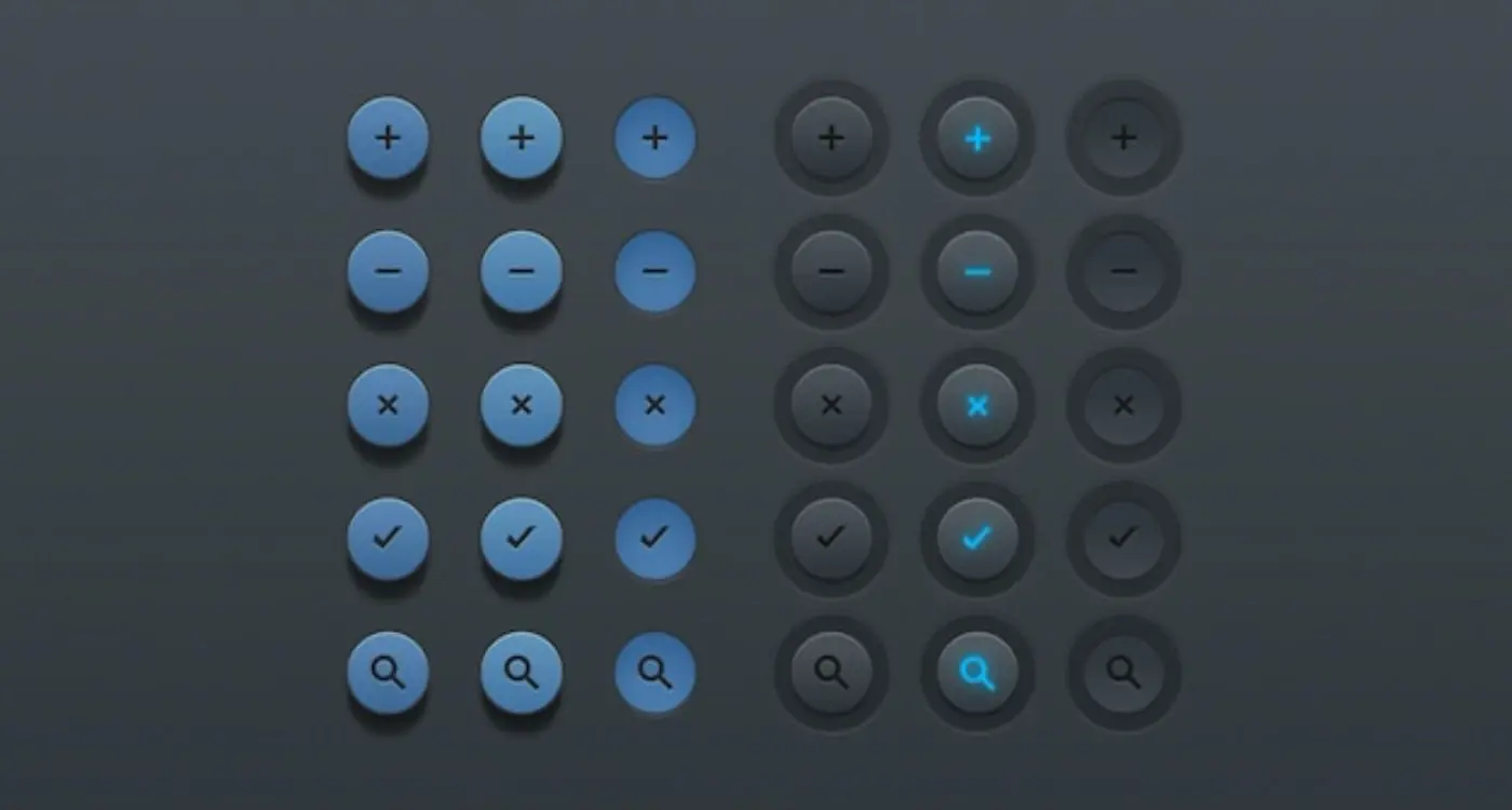
Button Presses and Touch Feedback
When you tap a button on your phone, something happens straight away—even before the app does what you asked for. The button might change colour, grow slightly bigger, or give your finger a tiny vibration. This immediate response is what we call touch feedback, and it's one of the most important parts of mobile app UX design.
Without proper touch feedback, users feel like they're tapping on a dead screen. They'll often tap multiple times, wondering if their touch registered at all. I've seen this happen countless times during user testing sessions—people frantically tapping buttons that don't respond quickly enough. It's frustrating and makes apps feel broken.
Types of Touch Feedback
Mobile apps use several types of feedback to confirm button presses:
- Visual changes like colour shifts or button shadows
- Haptic feedback through device vibrations
- Audio cues such as click sounds
- Animation effects like button scaling or ripple effects
Keep touch feedback under 100 milliseconds. Any longer and users will notice the delay, making your mobile app feel sluggish and unresponsive.
Getting the Balance Right
The trick with button feedback in interaction design isn't just adding effects—it's making them feel natural. Too much feedback becomes annoying; too little leaves users confused. The best feedback feels so smooth that users don't consciously notice it, but they'd definitely miss it if it wasn't there.
Different button types need different feedback approaches. A delete button might use red highlighting to warn users, whilst a simple navigation button might just need a gentle colour change. Context matters enormously in mobile app design.
Loading States and Progress Indicators
Loading states and progress indicators are probably the most overlooked micro-interactions in mobile apps, yet they're some of the most important. When someone taps a button or opens a screen, they need to know something is happening—even if it takes just a few seconds. Without proper feedback, users start thinking the app has broken or their phone has frozen.
The simplest loading state is a spinning circle that appears when content is being fetched. You'll see these everywhere: when you open Instagram and it loads your feed, or when you send a message in WhatsApp. These little spinners tell users "hang on, we're working on it" without saying a word. But there's more to it than just showing a spinner and hoping for the best.
Different Types of Loading Indicators
Progress bars work brilliantly when you can show actual progress—like uploading a photo or downloading a file. Users can see exactly how much is left, which makes waiting feel much more bearable. Then there are skeleton screens, which have become quite popular recently. Instead of showing a blank screen whilst content loads, you show grey placeholders that match the layout of what's coming. Facebook does this really well.
Making Waiting Feel Faster
The trick with loading states isn't just showing them—it's making them feel quick and smooth. A progress bar that fills up smoothly feels faster than one that jumps in chunks. Adding a subtle animation or changing the text ("Loading your photos..." then "Almost ready...") keeps people engaged. Some apps even show interesting facts or tips during longer loading periods, turning dead time into something useful.
Form Validation and Input Responses
Forms are everywhere in mobile apps—sign-up screens, checkout pages, contact forms. You name it. But here's what I've learned after years of UX design work: users absolutely hate filling out forms that don't give them proper feedback. They'll tap submit and wonder if anything happened; they'll make a mistake and have no idea what went wrong.
That's where form validation micro-interactions come to the rescue. These are the tiny responses your mobile app gives when someone types in a field, makes an error, or successfully submits information. Think of that little green tick that appears when you enter a valid email address, or the gentle shake animation when you get your password wrong.
Real-Time Feedback
The best form validation happens as users type, not after they've filled out everything and hit submit. When someone's entering their email, show them immediately if the format looks right. If they're creating a password, let them know straight away if it meets your requirements. This real-time approach in interaction design prevents frustration and saves time.
Good form validation feels like having a helpful friend looking over your shoulder, gently guiding you towards success rather than waiting to tell you what you did wrong
Error Messages That Actually Help
Nobody likes seeing error messages, but when they do appear, they need to be useful. Instead of just saying "Invalid input," tell users exactly what's wrong and how to fix it. Use colour changes, icons, and clear language that doesn't make people feel stupid. The micro-interaction should guide them towards the solution, not just highlight the problem.
Success states matter too—that moment when everything's filled out correctly deserves a small celebration. A subtle colour change or tick mark tells users they're on the right track.
Navigation Transitions and Screen Changes
Moving between screens in a mobile app might seem straightforward, but the micro-interactions that happen during these transitions are what separate good apps from great ones. Every time someone taps a button to go to a new screen, there's a brief moment where the app needs to communicate what's happening—and this is where navigation transitions shine.
The most common type you'll see is the slide transition. When you tap a menu item, the new screen slides in from the right whilst the old one slides out to the left. It's simple but effective because it gives users a sense of moving forward through the app. The reverse happens when they go back—the screen slides in from the left, creating a natural sense of returning to where they came from.
Popular Navigation Transition Types
- Slide transitions for moving between levels of content
- Fade effects for switching between tabs or similar content
- Modal pop-ups that slide up from the bottom
- Zoom transitions for moving from overview to detail screens
- Push notifications that animate in from the top
What makes these transitions work isn't just the visual effect—it's the timing and the feedback they provide. A good transition takes around 300 milliseconds; fast enough that users don't get impatient, but slow enough that they understand what's happening. Too fast and it feels jarring, too slow and people start wondering if something's broken.
The best navigation transitions also maintain visual continuity. When you tap on a photo in a gallery and it smoothly expands to fill the screen, that's a micro-interaction doing its job perfectly. It connects the action with the result, making the interface feel responsive and alive.
Pull-to-Refresh and Swipe Actions
Pull-to-refresh has become such a natural part of using a mobile app that most people don't even think about it anymore. You pull down on your social media feed, see that little loading animation, and wait for new content to appear. It's brilliant in its simplicity—and that's exactly what makes it such an effective micro-interaction.
The beauty of pull-to-refresh lies in how it mimics a physical action. When you pull something in real life, you expect a reaction. The same principle applies here. The user pulls down, the interface responds with visual feedback (usually a spinning icon or animated element), and then delivers fresh content. This creates a satisfying sense of control and accomplishment.
Common Swipe Actions That Work
Swipe actions take this concept even further by turning simple gestures into powerful shortcuts. Email apps have mastered this—swipe right to archive, swipe left to delete. Social apps use swipes for liking, sharing, or dismissing content. The key is keeping these actions predictable and consistent throughout your mobile app.
Always provide visual cues during swipe actions. Show icons or colour changes as the user swipes to indicate what will happen when they complete the gesture. This prevents accidental actions and builds confidence in your UX design.
Making Swipes Feel Right
The timing and responsiveness of these interactions matter more than you might think. A pull-to-refresh that feels too slow will frustrate users; one that's too fast might feel unnatural. The sweet spot usually sits around 300-500 milliseconds for the animation to complete. Swipe actions need even faster feedback—users should see immediate visual changes as they drag their finger across the screen.
Getting these micro-interactions right requires testing with real users on real devices. What feels smooth on a high-end phone might lag on older hardware, affecting the overall interaction design experience.
- Pull-to-refresh works best on content feeds and lists
- Swipe actions should be discoverable through subtle visual hints
- Always include haptic feedback where appropriate
- Test gesture sensitivity across different screen sizes
- Provide undo options for destructive swipe actions
Notification Badges and Status Updates
Those little red circles with numbers that appear on your app icons? That's what we call notification badges—and they're one of the most powerful micro-interactions in mobile app design. They serve as silent communicators, telling users there's something waiting for them without making any noise or taking up screen space.
Notification badges work brilliantly because they tap into our natural curiosity. When you see that red dot on your messaging app, you know someone has sent you something. The number tells you exactly how many unread messages are waiting. It's simple, direct, and gets the job done without being pushy.
Types of Notification Badges
- Numbered badges showing exact counts (like 5 new emails)
- Simple red dots indicating new activity without specific numbers
- Coloured indicators showing different types of updates
- Progress rings displaying completion status
Status updates work hand-in-hand with badges. Think about how your phone shows "Delivered" or "Read" under text messages, or how social media apps display "Online" next to friends' names. These micro-interactions provide instant feedback about what's happening in real-time.
The key to effective notification badges is restraint. Too many badges create notification fatigue—users start ignoring them altogether. Smart apps only badge truly important updates and clear badges immediately when users view the content. Some apps even let users customise which types of notifications earn a badge, putting control back in the user's hands.
Best Practices
Keep badge numbers accurate and update them instantly when content is viewed. Use consistent styling across your app so users know what to expect. Most importantly, respect your users' attention—badge notifications should genuinely add value, not just grab eyeballs.
Conclusion
Micro-interactions might seem like tiny details, but they're what separate good mobile apps from great ones. When I look at the most successful apps we've built over the years, they all share one thing in common—they pay attention to these small moments that make users feel connected to the experience.
From the satisfying haptic feedback when you tap a button to the smooth transitions between screens, these interactions work together to create something bigger than their individual parts. They guide users through your app without them even realising it's happening. A well-timed loading animation can turn frustration into patience; a clever form validation message can prevent users from abandoning their task halfway through.
The beauty of micro-interactions lies in their subtlety. Users don't consciously notice them when they're done right—they just feel like the app "gets" them. But when they're missing or poorly executed, that's when people start to feel frustrated or confused. Your UX design becomes clunky, and users begin to question whether your app is worth their time. Understanding the difference between animations and micro-interactions is crucial when building effective user experiences.
The key is finding the right balance. Too many micro-interactions can overwhelm users and slow down their experience. Too few, and your app feels lifeless and unresponsive. The best interaction design happens when these elements support user goals rather than getting in their way. They should speed up tasks, provide reassurance, and make complex actions feel simple. Learning how to add micro-interactions without overdoing it is essential for creating successful mobile apps. Additionally, consider the cost of implementing these features early in your planning process. If you're looking to get started, exploring the right development tools will help you bring these interactions to life effectively. When you get this balance right, you're not just building a mobile app—you're crafting an experience that users will want to return to again and again.