
What Are the Key Elements of Effective Button Design?
There's nothing quite like watching users completely ignore the most important button on your app screen. You've spent weeks perfecting the functionality, the user flow is logical, and yet somehow people are tapping everything except the one button that actually matters. It's maddening, honestly—and it happens more often than you'd think.
After building apps for over eight years, I've seen this scenario play out countless times. A brilliant app idea gets sabotaged by poorly designed buttons that users either can't find, don't trust, or simply don't understand. The thing is, buttons aren't just pretty decorations on your interface; they're the bridge between what users want to do and actually getting it done. Get them wrong and your conversion rates will suffer—get them right and users will flow through your app like water.
Button design might seem straightforward on the surface, but there's actually a lot more psychology and science involved than most people realise. The colour you choose, the size you make it, where you place it on the screen—all of these decisions directly impact whether users will tap or scroll past. I've seen simple button changes increase conversion rates by 30% or more, which can literally make or break an app's success.
The best button design is invisible to users—they know exactly what to tap without having to think about it
In this guide, we'll break down everything you need to know about creating buttons that actually work. From understanding visual hierarchy to mastering colour psychology, we'll cover the practical techniques that turn hesitant browsers into confident users. Because at the end of the day, your app is only as good as its ability to guide users towards the actions that matter most.
Understanding Button Hierarchy and Visual Weight
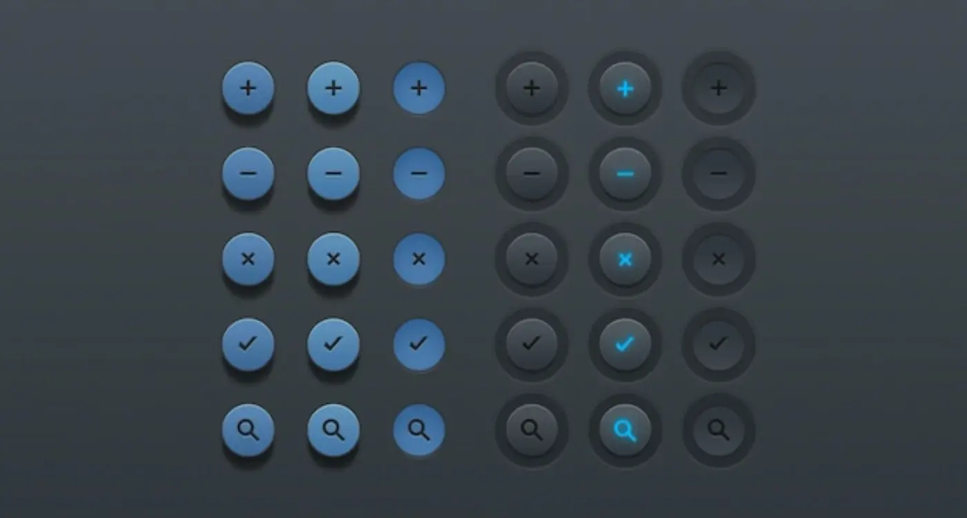
When I'm designing interfaces for clients, one of the biggest mistakes I see is treating all buttons equally. It's like having a conversation where every word is shouted at the same volume—nobody knows what's actually important. Button hierarchy is basically about creating a clear pecking order that guides users through your app without them having to think too hard about it.
Primary buttons should dominate the visual landscape. These are your "Add to Cart", "Sign Up", or "Send Message" buttons—the actions that drive your business forward. They need the most visual weight through bold colours, larger sizes, and prominent placement. Secondary buttons like "Cancel" or "Learn More" should step back visually; they're there when needed but shouldn't compete for attention.
The Science Behind Visual Weight
Visual weight isn't just about making things bigger (though size certainly helps). Colour saturation plays a huge role—a bright blue button will always grab more attention than a grey one. Contrast with the background matters too; a dark button on a light surface creates more impact than similar tones.
Typography weight adds another layer. Bold text feels heavier than regular text, even at the same size. Spacing around buttons also affects their perceived importance—give your primary action room to breathe, and it'll naturally feel more significant.
Common Hierarchy Patterns That Work
Here's what I typically recommend to clients based on what actually works in the real world:
- Primary: High contrast colour, medium to large size, bold text
- Secondary: Outlined or ghost style, same height as primary but less visual weight
- Tertiary: Text links or very subtle buttons for less important actions
- Destructive: Red or warning colours, but not more prominent than primary actions
The key is consistency across your entire app. Users should never have to guess which button is most important on any given screen.
Size, Shape, and Spacing Fundamentals
Getting the sizing right for mobile buttons is honestly more science than art at this point. I mean, we've got years of user testing data that tells us exactly what works and what doesn't. The magic number for mobile touch targets? 44 pixels minimum — that's Apple's guideline and it's spot on. But here's the thing, I often go bigger for primary CTA buttons because larger buttons just perform better.
When I'm working on a new app design, I see clients obsessing over making buttons as small as possible to "save space". Bad idea. Your users thumbs haven't shrunk, and cramped interfaces lead to frustrated users and poor conversion rates. Secondary buttons can be slightly smaller — around 40 pixels — but your main action buttons should be chunky and confident.
Shape Psychology in Button Design
The shape debate is interesting because it's shifted over the years. Rounded corners vs sharp corners vs pill-shaped buttons — they all send different psychological signals to users. Rounded corners feel friendlier and more approachable; sharp corners feel more corporate and serious. Most of my fintech clients go for subtle rounded corners (4-8px radius) while my healthcare apps often use more pronounced rounding.
For mobile apps, I recommend a minimum touch target of 48px for primary buttons and 40px for secondary actions. This gives users enough room to tap accurately without hitting neighbouring elements.
The Spacing Equation
Spacing around buttons is where I see the most mistakes. You need at least 8px of padding inside the button and 16px of clear space around it. But here's what really matters — consistency. If your primary buttons have 12px vertical padding, every primary button should have 12px vertical padding.
- Primary buttons: 16px horizontal padding, 12px vertical padding
- Secondary buttons: 12px horizontal padding, 8px vertical padding
- Icon buttons: 8px padding on all sides
- Minimum touch target: 44px x 44px for all interactive elements
- Spacing between buttons: 16px minimum for mobile interfaces
The spacing between multiple buttons is just as important as the buttons themselves. Stack them vertically with 12px gaps or place them horizontally with 16px separation. Never let your buttons feel cramped — users should be able to tap confidently without worrying about hitting the wrong thing.
Colour Psychology and Contrast in Button Design
Right, let's talk about colour—because getting this wrong can literally kill your conversion rates. I've seen perfectly good apps struggle because someone decided their primary action button should be a lovely shade of beige. Not joking! Colour psychology plays a crucial role not just in app store performance but in every aspect of your interface design.
When I'm designing buttons for clients, I always start with the basics: red suggests urgency or warning, green implies success or go-ahead, blue feels trustworthy and safe. But here's the thing—context matters more than you might think. A red "Delete Account" button makes perfect sense, but a red "Buy Now" button? That's going to make people hesitate. I've tested this countless times and the data doesn't lie.
The Contrast Rule That Actually Works
Contrast is where most people mess up. Your button needs to stand out from its background—not just a bit, but properly stand out. The technical standard is a 3:1 contrast ratio for large elements, but honestly? I aim for much higher. If your grandmother can't see your button clearly, neither can a good chunk of your users.
Here's what I've learned works consistently across different apps and industries:
- Primary buttons: Use your brand's main colour, but make sure it contrasts strongly with the background
- Secondary buttons: Outlined or ghost buttons work well, but they need enough contrast to be clearly visible
- Destructive actions: Red or orange, but not so bright they hurt to look at
- Success actions: Green works, but avoid colours that clash with your overall design
One mistake I see constantly is using the exact same colour for all buttons. Sure, consistency is important, but hierarchy matters more. Your "Sign Up" button should be more prominent than your "Learn More" button—colour helps establish that visual priority.
Typography and Text Guidelines for Buttons
The words on your buttons matter more than you might think—and I mean that seriously. After building hundreds of apps, I can tell you that the difference between "Submit" and "Get My Free Report" isn't just semantic; it's the difference between a 2% conversion rate and an 8% one. Users scan button text in milliseconds, so every single word needs to earn its place.
Let's talk font choices first. You want something that's readable at small sizes because mobile screens don't give you much room to work with. San-serif fonts like Helvetica, Roboto, or San Francisco work brilliantly for buttons—they're clean, they scale well, and they don't get muddy when users are squinting at their phones in bright sunlight. I've seen too many apps use fancy display fonts on buttons that become completely illegible at 14px.
Writing Button Text That Actually Works
Your button text should tell users exactly what happens when they tap it. Instead of generic words like "Click Here" or "Submit", use action-oriented language: "Download App", "Start Free Trial", "Book Table". The more specific you are, the more confident users feel about tapping that button.
The best button text removes all uncertainty about what happens next—users should never have to guess the outcome of their action.
Keep your text short but descriptive. Mobile screens are cramped enough without worrying about text wrapping onto multiple lines. Generally, 1-3 words work best for primary actions. And here's something that catches people out—make sure your text contrast meets accessibility standards. Light grey text on a coloured background might look stylish, but if users can't read it easily, they won't tap it. Test your buttons in different lighting conditions; you'll be surprised how often "readable" indoor text becomes invisible outdoors.
Interactive States and Feedback Design
Right, let's talk about something that separates good buttons from great ones—how they behave when users actually interact with them. I've seen countless apps with beautiful static button designs that feel completely dead when you tap them. It's honestly a bit jarring when there's no feedback at all.
Your buttons need at least four distinct states: default, hover (for web), pressed, and disabled. Each state should feel different but still clearly be the same button. The pressed state is probably the most important—users need immediate visual confirmation that their tap registered. A subtle colour darkening or slight scale reduction (around 95% of original size) works brilliantly for this.
Timing and Animation Principles
Here's where things get a bit technical but bear with me. Your button animations should be quick but not instant—somewhere between 100-200 milliseconds feels natural. Any longer and users will think the app is slow; any faster and they might miss the feedback entirely.
Loading states deserve special attention too. If your button triggers a process that takes more than half a second, show a loading indicator. Don't just disable the button and leave users wondering what happened. Understanding psychological triggers that boost app conversion can help you design feedback states that actually increase user confidence.
Different Types of Interactive Feedback
- Visual feedback: colour changes, shadows, scaling effects
- Haptic feedback: subtle vibrations on mobile devices
- Audio feedback: system sounds for confirmation
- Loading indicators: spinners, progress bars, skeleton screens
- Error states: clear messaging when something goes wrong
The key thing to remember is consistency across your entire app. Once you've established how buttons behave in one screen, users will expect the same behaviour everywhere else. Breaking that pattern without good reason just confuses people—and confused users tend to abandon apps pretty quickly.
Accessibility and Inclusive Button Design
Right, lets talk about something that's close to my heart—making buttons work for everyone. I've seen too many apps fail because they forgot about users with disabilities, and honestly, its not just the right thing to do, it's good business sense. About 15% of the worlds population has some form of disability, which means you could be excluding millions of potential users if your button design isn't accessible.
The foundation of accessible button design starts with colour contrast. You need at least a 4.5:1 contrast ratio between text and background for normal text, and 3:1 for large text. But here's the thing—don't rely on colour alone to communicate important information. I always tell my clients to think about users with colour blindness or visual impairments who might not see your red "delete" button the way you do. Handling accessibility requirements thoughtfully extends to every aspect of app design, from dietary needs in food apps to visual accessibility in button design.
Touch Targets and Motor Accessibility
Touch targets are where I see the most mistakes. Apple recommends 44px minimum, Google says 48dp—but I usually go bigger, especially for primary actions. Users with motor impairments, arthritis, or even just cold fingers need generous touch areas. And please, leave enough space between buttons; accidental taps are frustrating for everyone but can be particularly problematic for users with limited dexterity.
Always test your buttons with VoiceOver on iOS or TalkBack on Android. If the screen reader can't announce what the button does clearly, your users won't know either.
Screen Reader Compatibility
Screen readers need proper labels to understand your buttons. A button that just says "click here" is useless—it should say something like "Add item to basket" or "Delete photo". I also make sure all interactive elements have focus indicators that are visible and clear; keyboard navigation users depend on these visual cues to understand where they are on screen.
- Use semantic HTML button elements, not divs with click handlers
- Provide alternative text for icon-only buttons
- Include loading states that announce to screen readers
- Test with actual assistive technologies, not just automated tools
- Consider users with cognitive disabilities—keep button labels simple and consistent
Platform-Specific Button Considerations
After years of building apps for both iOS and Android, I can tell you that ignoring platform conventions is one of the biggest mistakes I see developers make. Users have expectations based on their operating system, and fighting against those expectations is like swimming upstream—it's exhausting and usually pointless.
iOS users expect buttons to follow Apple's Human Interface Guidelines. That means rounded corners, specific padding, and particular colour schemes that feel native to the platform. Apple users are incredibly tuned into these details; they'll notice if something feels "off" even if they can't articulate why. I've seen apps get negative reviews simply because the buttons didn't feel like they belonged on an iPhone.
iOS vs Android Button Differences
Android users, on the other hand, are more accustomed to Material Design principles. This means different button elevations, ripple effects, and distinct visual feedback patterns. The beauty of Material Design is in its subtle shadows and the way buttons respond to touch with that satisfying ripple animation.
- iOS buttons typically use flat design with subtle shadows
- Android buttons often feature more pronounced elevation and depth
- iOS favours rounded rectangles while Android uses varying corner radii
- Touch feedback differs—iOS uses subtle highlights, Android uses ripple effects
But here's what really matters: consistency within your chosen platform. Pick your platform's conventions and stick to them throughout your app. Mixed approaches confuse users and make your app feel unprofessional. I've watched apps fail not because they had bad ideas, but because they felt foreign to users who couldn't quite put their finger on why the interface felt wrong.
The good news? Both platforms provide comprehensive design guidelines. Follow them, and you're already ahead of half your competition.
Testing and Optimising Button Performance
Right, so you've designed your buttons—they look good, they're accessible, and they follow all the best practices we've covered. But here's the thing: until real users start tapping them, you won't know if they actually work. Testing button performance isn't just about whether they function; it's about understanding how they perform in the wild.
A/B testing is your best friend here. I've seen conversion rates jump by 40% just from changing a button's colour or moving it a few pixels up the screen. Start with the basics: test different colours, sizes, and text variations. But don't just test randomly—have a hypothesis. Maybe your primary CTA button isn't standing out enough, or perhaps your secondary buttons are competing too much for attention?
The difference between a good button and a great button often comes down to a few percentage points in conversion rates, but those points can mean thousands of pounds in revenue.
Heat mapping tools are brilliant for understanding how users actually interact with your buttons. You might discover that people are trying to tap areas that aren't even buttons, or that your carefully designed CTA is being completely ignored. I've worked on apps where users were consistently missing the main action button because it was positioned just outside their natural thumb reach.
Key Metrics to Track
Focus on click-through rates, conversion rates, and task completion times. But don't forget about the softer metrics like user frustration—if people are tapping multiple times or hesitating before interacting, that tells you something important about your button design. The goal isn't just getting clicks; it's creating confident, successful interactions that move users forward in their journey. Learning to turn user frustration into valuable insights can help you identify button design issues before they become conversion killers.
After years of building mobile apps and watching users interact with thousands of different button designs, I've learned that great button design isn't about following every single rule perfectly—it's about understanding your users and making thoughtful decisions that guide them naturally through your app.
The fundamentals we've covered matter, don't get me wrong. Button hierarchy keeps your interface organised; proper sizing makes interaction comfortable; colour and contrast ensure visibility; clear typography communicates purpose. But here's what I've noticed: the most successful apps I've built are the ones where button design feels invisible to users. They tap, swipe, and navigate without thinking about it.
That's the real goal, isn't it? Creating buttons that work so well users barely notice them. When someone opens your app and immediately knows which button to press next, you've done your job right. When they can use your app one-handed while walking down the street? Even better.
I always tell my clients that button design is like good plumbing—nobody talks about it when its working perfectly, but everyone notices when something goes wrong. A button that's too small, poorly positioned, or unclear in its purpose can derail an entire user journey. On the flip side, well-designed buttons can boost conversions, reduce support tickets, and create those "this app just gets me" moments that turn casual users into loyal customers.
The mobile landscape keeps evolving, and button design evolves with it. New interaction patterns emerge, accessibility standards improve, and user expectations shift. But the core principles remain the same: make it clear, make it accessible, and make it work for real people using real devices in real situations. That's what separates good apps from forgettable ones.
Share this
Subscribe To Our Learning Centre
You May Also Like
These Related Guides
What Button Design Principles Improve App Usability?
What Are the Most Common Types of Micro-Interactions in Mobile Apps?